


expressions.com
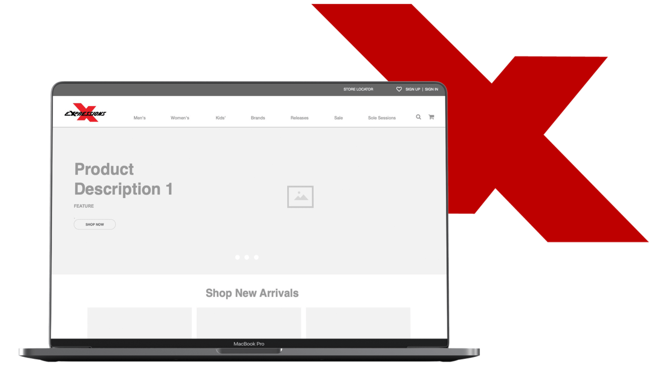
Expressions ecommerce store wireframe prototype on a laptop

Expressions
Ecommerce Store

How can I create an online shopping experience that meets the goals of the users and the needs of the business?

Expressions Ecommerce Store

Client

Expressions

Retail Footwear & Apparel · Concept Sprint

Role

User Research

Category

  • Information Architecture
  • User Flows
  • UX Research

Year

2 week sprint

The Opportunity

Bringing Expressions Online

Expressions was a brick-and-mortar footwear and apparel retailer without an online shopping experience. I explored how its product catalog could translate into a clear ecommerce experience that made products easy to browse, find, and purchase.

Approach

Design Process

From Research to Structure

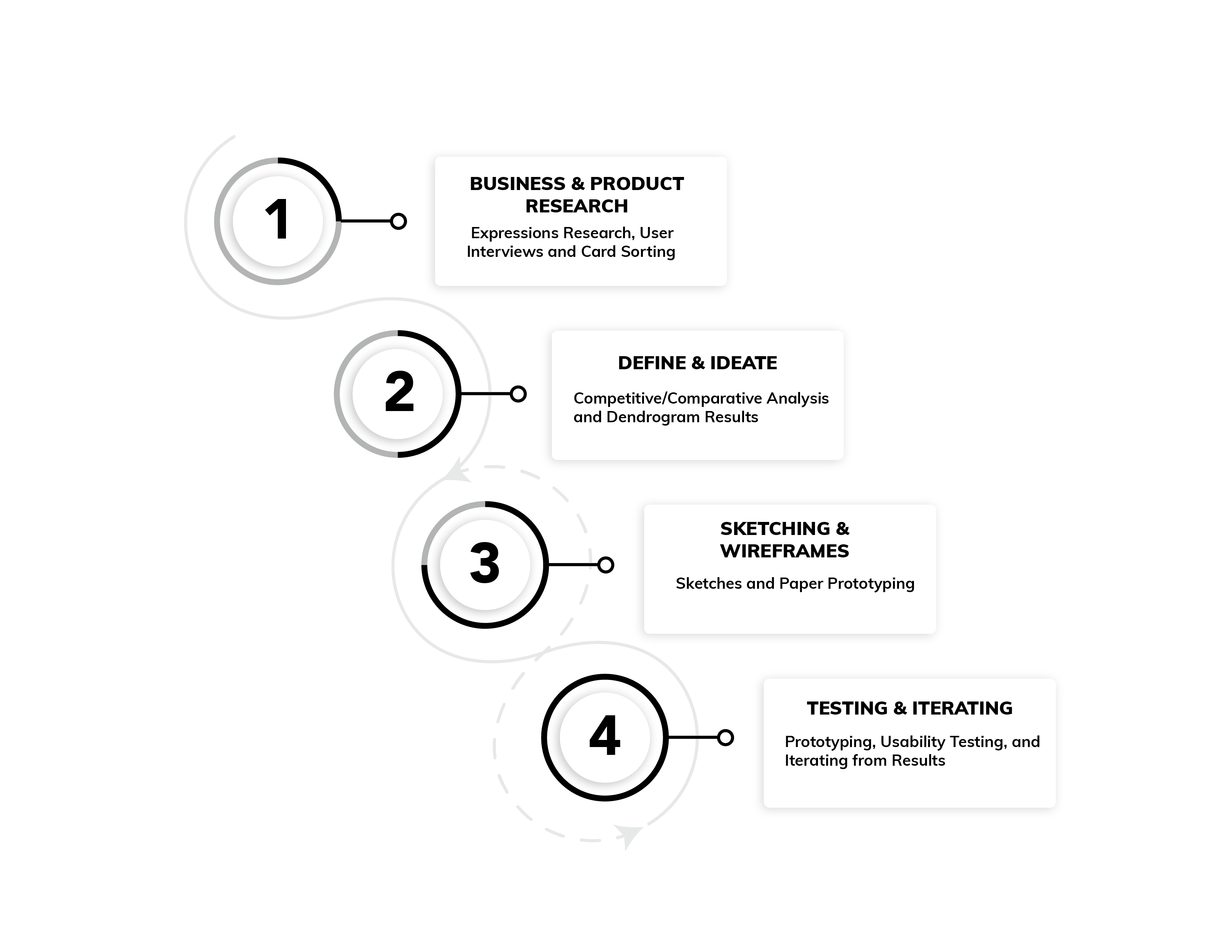
I moved from understanding shopper behavior to defining the site structure, testing how products should be organized, and translating those decisions into a prototype.

Process diagram: Business and Product Research, Define and Ideate, Sketching and Wireframes, Testing and Iterating

Research

Understanding Shoppers

How People Navigate Online Shopping

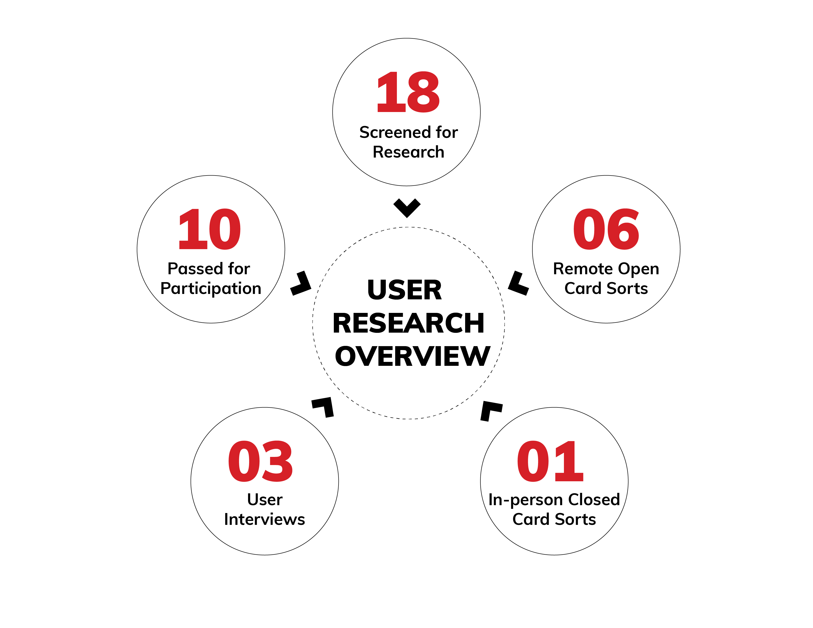
I used interviews, competitive analysis, site audits, and contextual inquiry to understand how shoppers find products, make decisions, and move through ecommerce experiences.

Research overview graphic with five red figures: 18, 10, 06, 03, and 01 arranged around a center point

Understanding the user

User Interviews

Through user interviews I learned the pain points that users currently have when online shopping for clothing and footwear. User interviews were pivotal to how I would approach the layout of Expressions e commerce website.

I'm looking for convenience! I don't like to browse

Research Participant

I want to get in and get out, I know what I am looking for

Research Participant
Market context

Competitive analysis

I studied peers in athletic footwear and apparel to understand navigation patterns shoppers already recognize.

Champs Sports logo

Champs Sports

Multi-sport breadth

Position

  • Champs' unique market position relates to the range of athletic products offered, as it provides apparel across sports and apparel lines.
Foot Locker logo

Foot Locker

Category depth

Position

  • Foot Locker offers products relating to a multitude of sports, including basketball, running and general fitness.
Footaction logo

Footaction

Youth style focus

Position

  • Footaction targets the young male demographic. The merchandise offered by Footaction focuses less on functionality and more on athletic style.
Patterns to carry forward

Competitive takeaways

Across Champs, Foot Locker, and Footaction, two patterns consistently reduced friction for goal-oriented shoppers and became non-negotiable inputs into the IA.

01

Keep global navigation consistent

  • Recognizable top-level destinations (by sport, brand, and footwear type) let shoppers orient in seconds. Matching these conventions reduces wayfinding cost before product comparison even starts.

02

Make subcategories specific

  • Granular groupings by activity and style help shoppers jump straight to intent instead of scanning long, mixed product lists. Specific labels outperformed broad catch-all categories.

Information Architecture

Card Sorting

  1. Step 01

    Cards

    I collected a sample cross-section of 100 products sold by the retailer and put each piece on a separate 'card'.

  2. Step 02

    Participants

    I asked participants to sort the cards into categories (open) or the given categories (closed) based on what made sense to them.

  3. Step 03

    Results

    I used this data to help organize the information on the website, keeping the users in mind.

Design

Ideation

Sketching

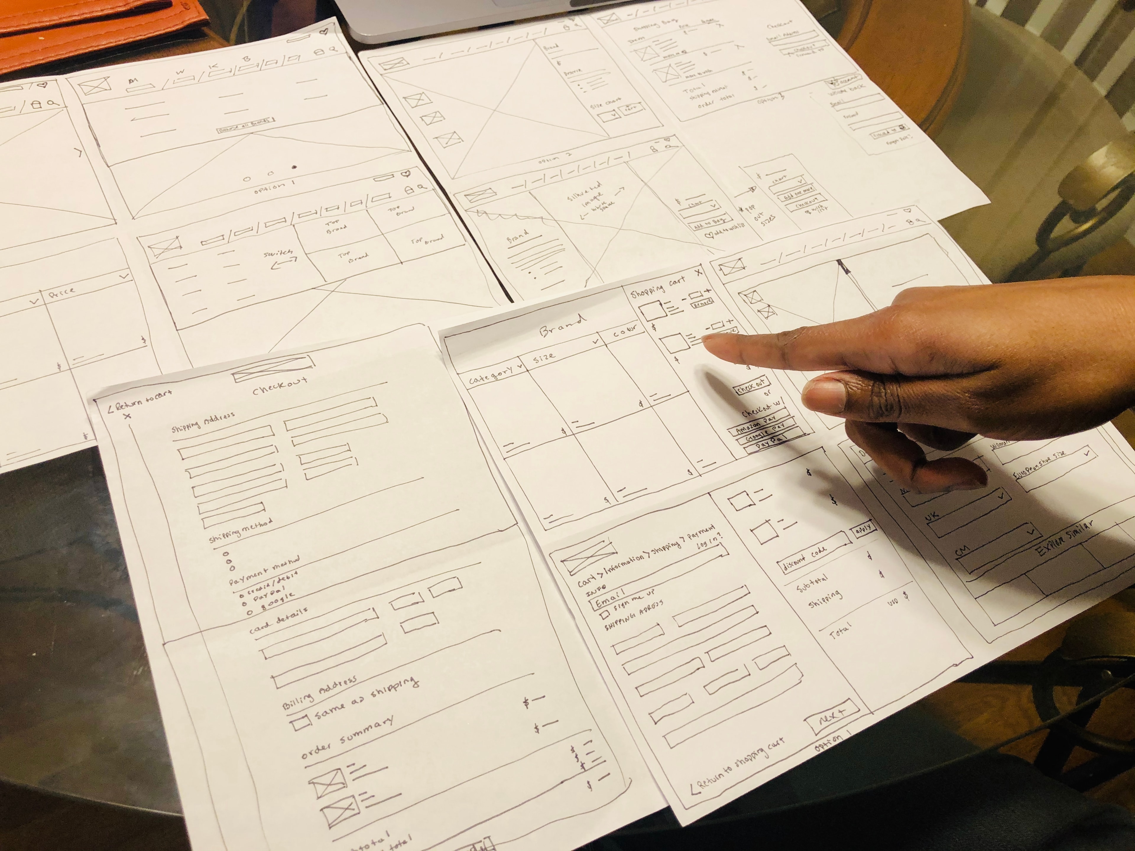
Based on my user research and competitive analysis, I sketched ideas to test various checkout processes and product pages.

I used competitive analysis to pull known design patterns that would make the e-commerce experience recognizable, and pulled from interviews to include what was important for users to see during online shopping.

Usability testing

Paper Prototyping

Findings and Challenges

01

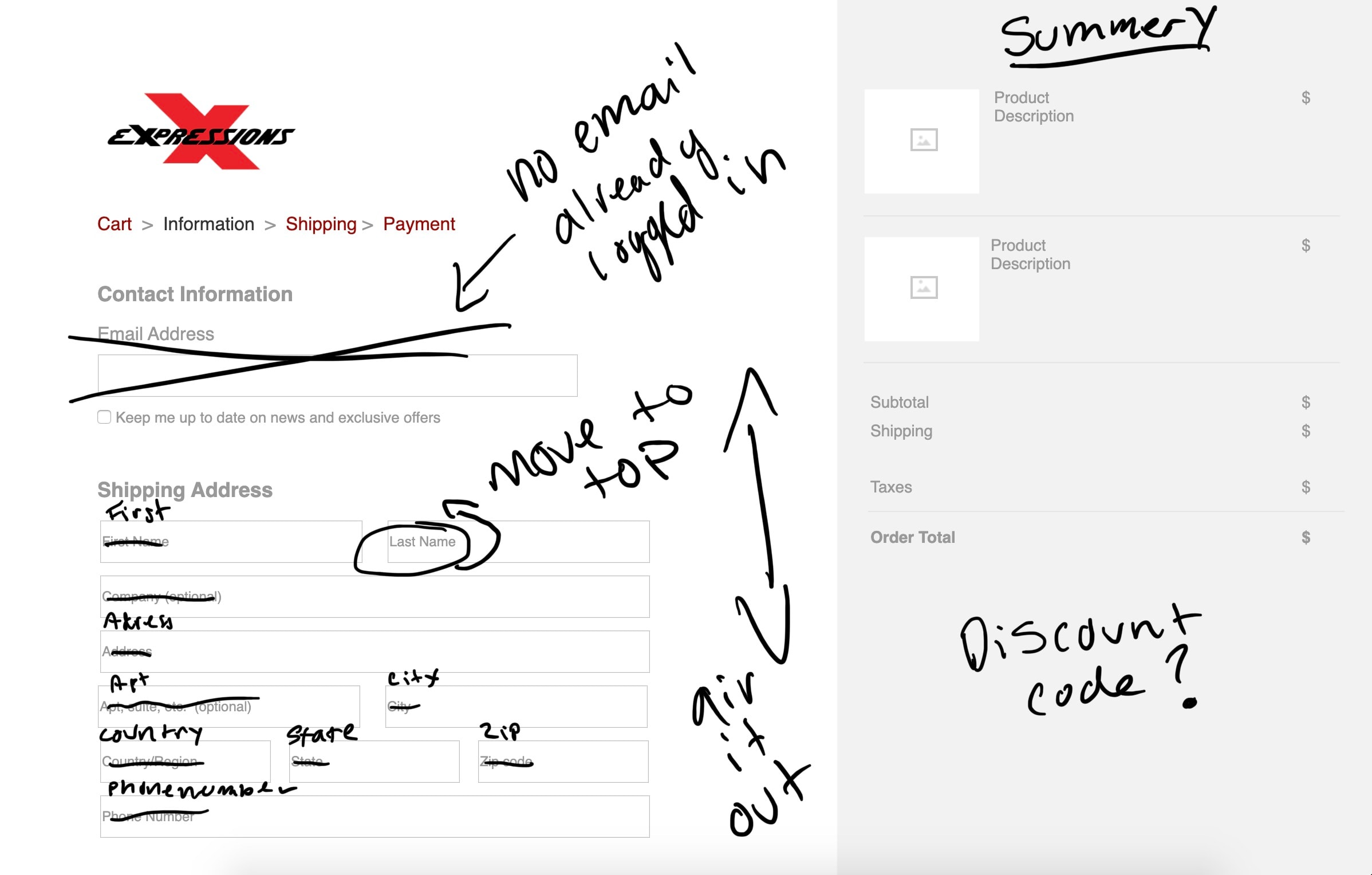
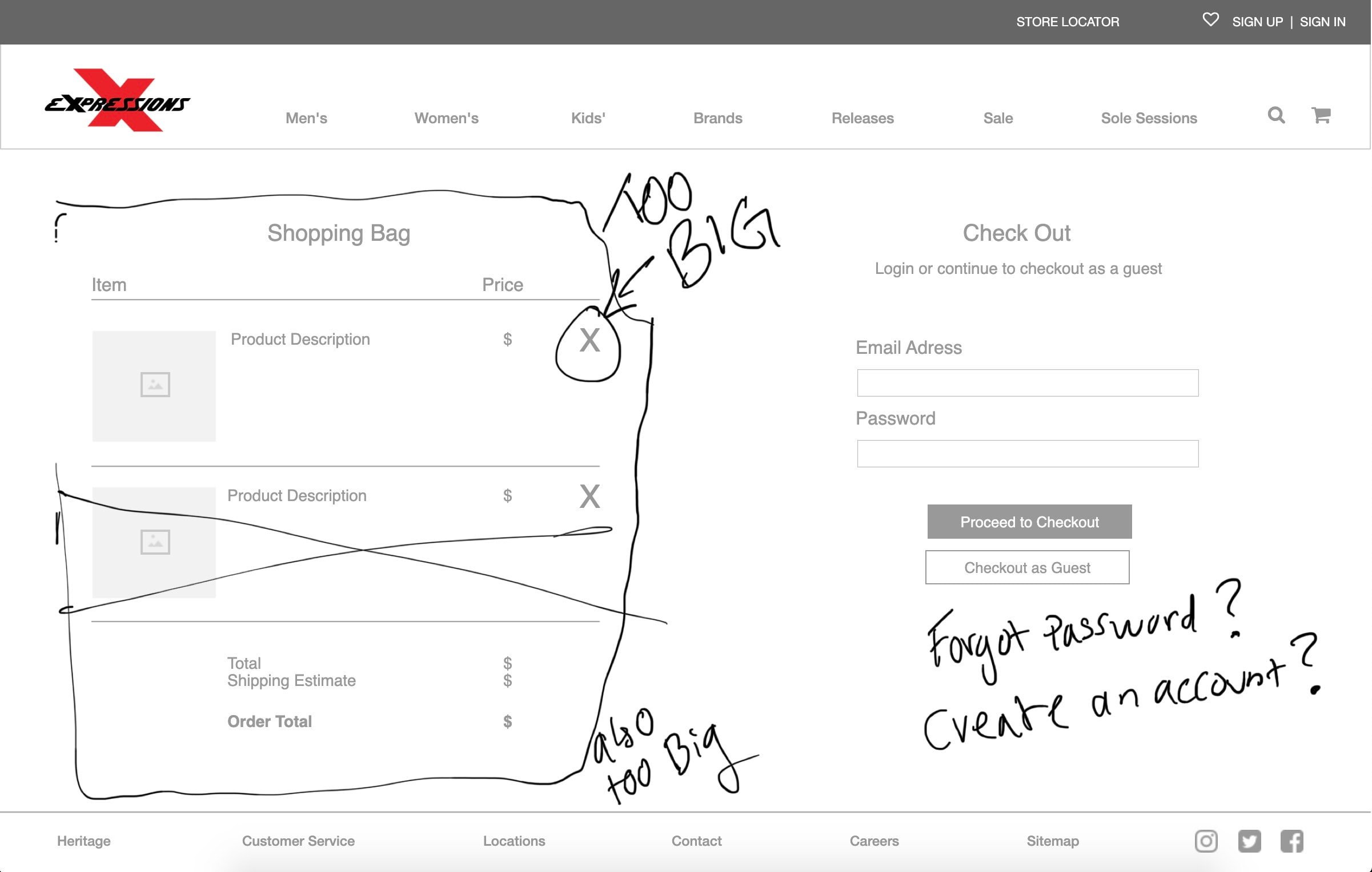
Too much scrolling in the checkout screen, the participant expressed they are afraid they'll miss information in a one page checkout process.

02

Wanting to see the product clearly and having the details in the same place.

03

Participants don't mind scrolling; only to look for additional information.

Paper prototypes of Expressions shopping and checkout screens laid out for testing

Iterations

Usability Testing Results

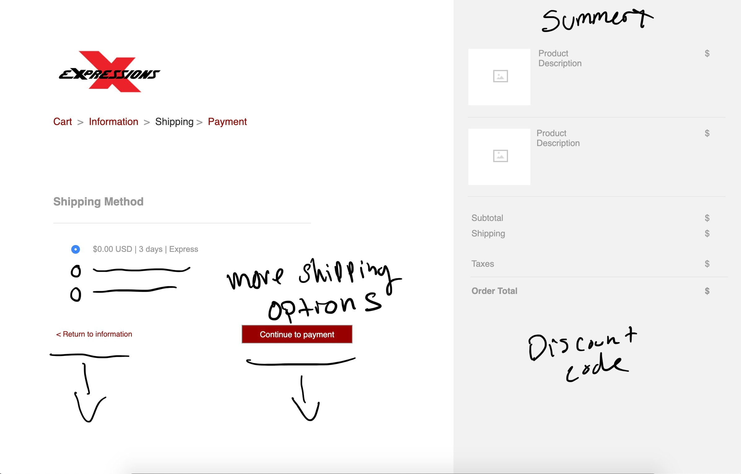
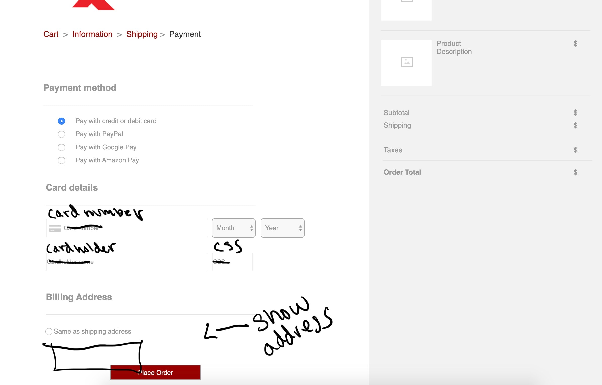
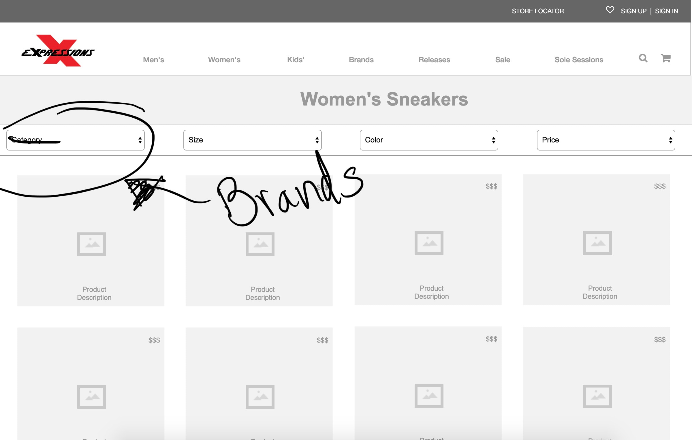
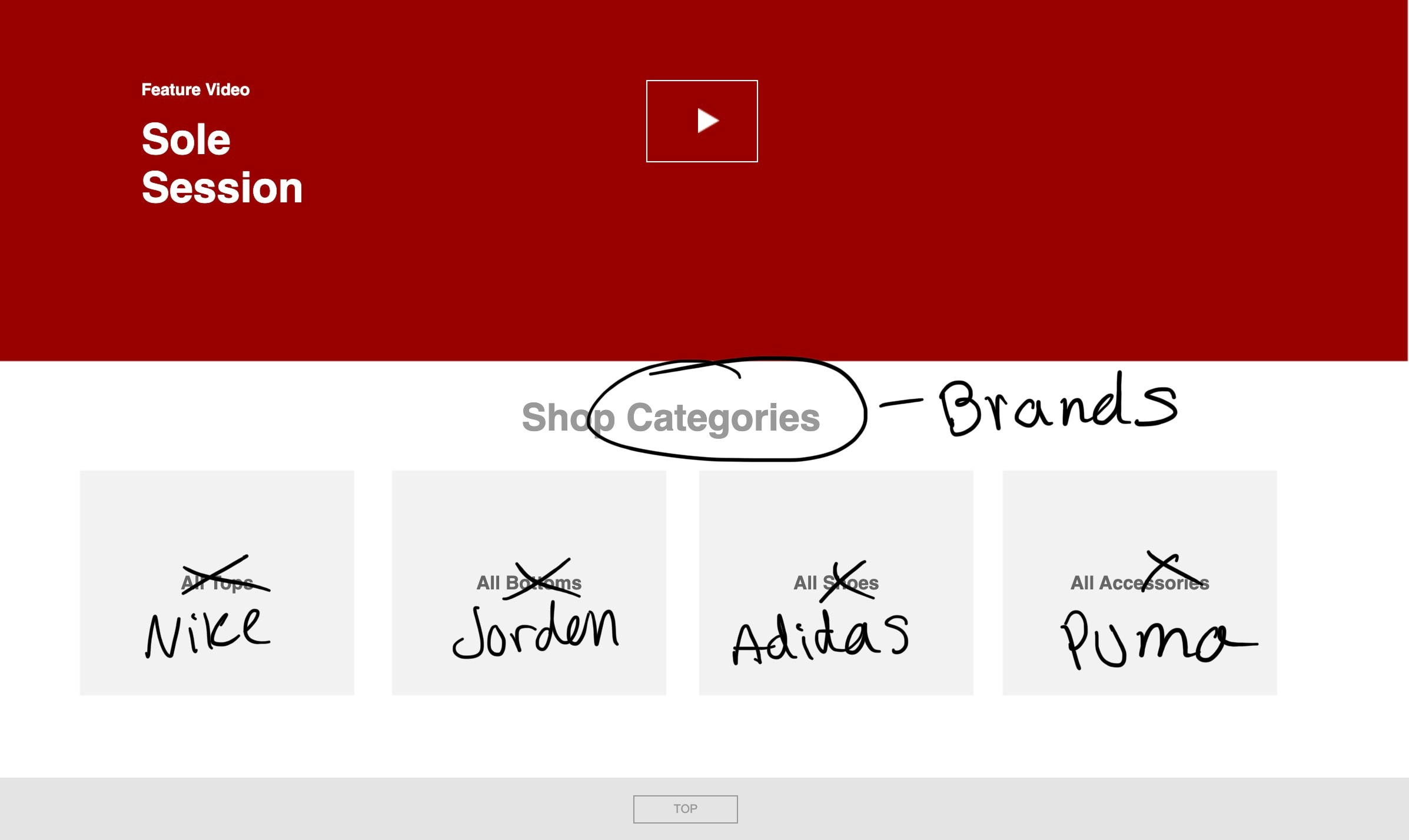
Iteration screen 1 — annotated wireframe from usability testing
Iteration screen 2 — annotated wireframe from usability testing
Iteration screen 3 — annotated wireframe from usability testing
Iteration screen 4 — annotated wireframe from usability testing
Iteration screen 5 — annotated wireframe from usability testing
Iteration screen 6 — annotated wireframe from usability testing
Iteration screen 7 — annotated wireframe from usability testing

What I changed

01

Reduce oversized shopping bag and checkout controls

02

Clarify login, guest checkout, and password recovery paths

03

Move shipping higher and increase field breathing room

Setting up the structure

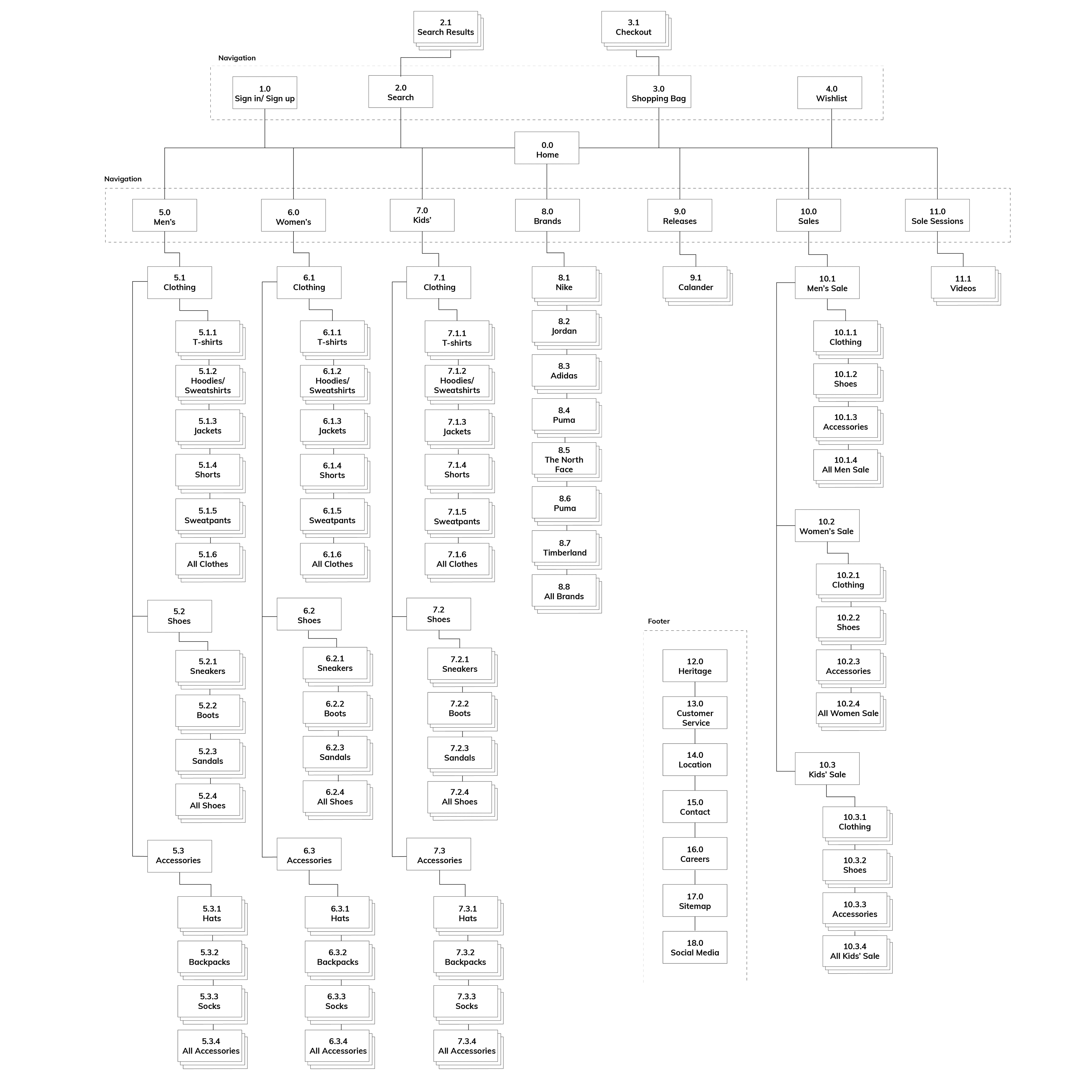
Site map

Card sorting and user and business research helped drive the information architecture of Expressions' e-commerce site. The taxonomy of the main navigation was created by the most popular categories that users sorted products into.

Primary pathways include Men's, Women's, Kids', Brands, Releases, and Sale, with utility destinations for search, shopping bag, wishlist, and account.

Expressions site map showing Home, category trees, brands, sales, checkout, and footer destinations

Solution

Turning the Structure Into a Shopping Experience

Ecommerce Experience

The final prototype translated the information architecture into a browsable ecommerce experience, giving shoppers clear paths to discover products, navigate categories, and move toward purchase.

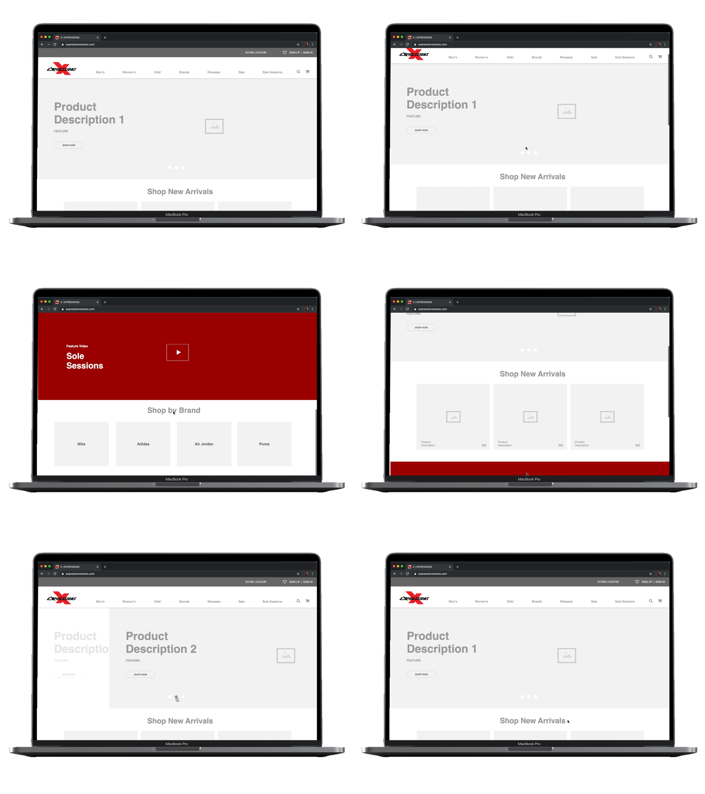
Expressions home page wireframe with campaigns and brand shortcuts

Home page

When users see the home page they are greeted with large product pictures and campaigns. While scrolling they are able to discover what Expressions has to offer in a snapshot.

The user can easily start their search for what they are looking for with shortcuts to popular brands.

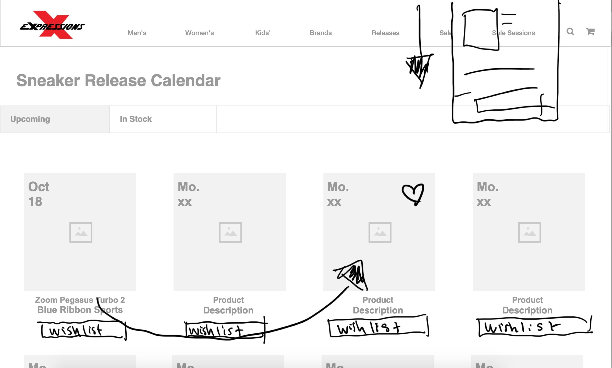
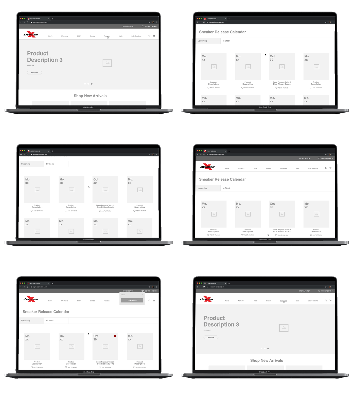
Wireframe pairing a sneaker release calendar with wishlist planning

Sneaker release calendar and wishlist

Release dates are a very important thing to the sneaker community. Often times users look at release dates and prices ahead of time.

Pairing a wishlist with the release calendar allows users to plan accordingly for when the time comes to make a purchase.

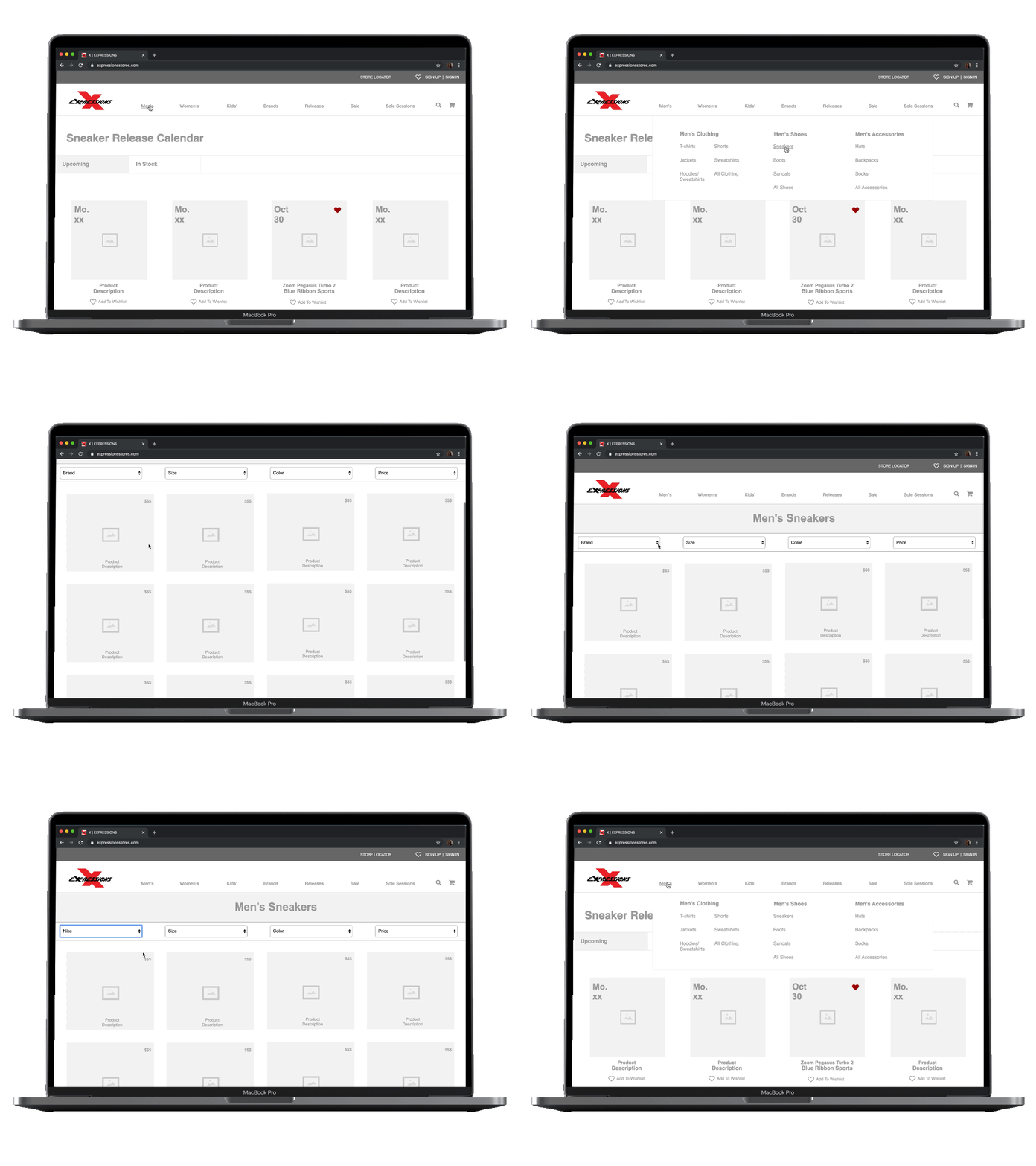
Product listing wireframe with filters, prices, and wishlist heart

Product discovery

When users are searching for products, they are able to navigate to exactly what they are looking for using the mega menu.

Once on a product discovery page, the user is met with clear prices and descriptions with the ability to filter their search to their liking.

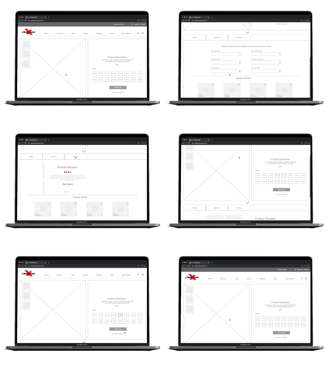
Product detail wireframe with size selection, add to cart, and wishlist

Product page and reviews

The product page is designed to be product driven and give the user exactly what they are looking for.

When the user scrolls down, they are given additional information that may assist in their online shopping experience. This includes reviews and a size converter that autofills based off the users true size and how a product runs.

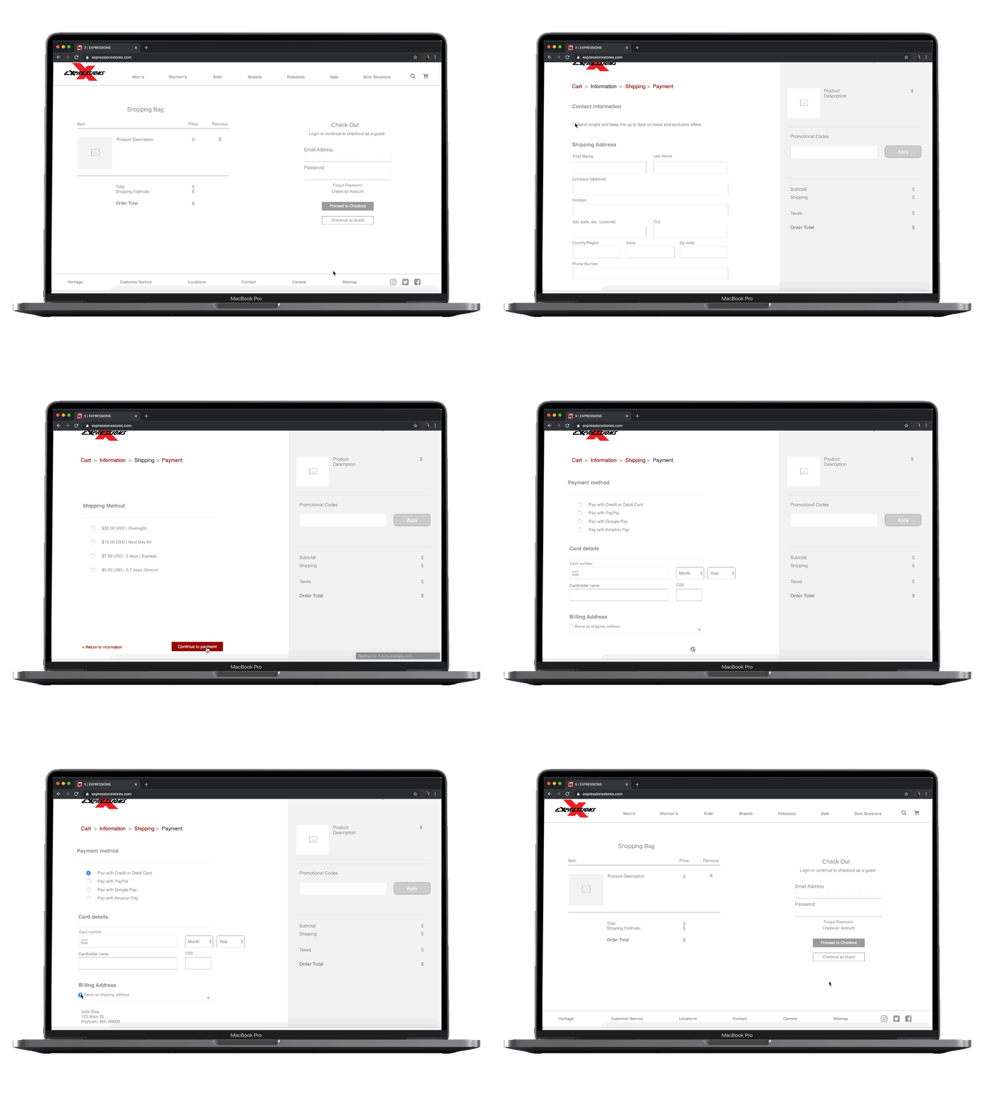
Shopping bag and checkout wireframe with guest checkout and order summary

Check out

This checkout process allows the user to know exactly what they are purchasing with a summary on the right, and a progression system moving through the checkout process.

The user knows exactly where they are in their checkout process, and are allowed to return if they have made a mistake.

Next Steps

During this project, I learned the steps that need to be taken in order to create an e-commerce website for a store. Retailers can have hundreds of items in their inventory and designing the information architecture successfully will determine the positive or negative experience of the user.

For Future Iterations I Will

  1. 01

    Continue to design by building a Hi-Fi prototype with images and a brand identity.

  2. 02

    Explore features to make browsing the site more convenient.

  3. 03

    Expand the wishlist to incorporate reminders for release dates.

  4. 04

    Consider a mobile application.

Next project: Bend HSA Portal Redesign

VIEW NEXT PROJECT