Screened for Research

portal.bend.com
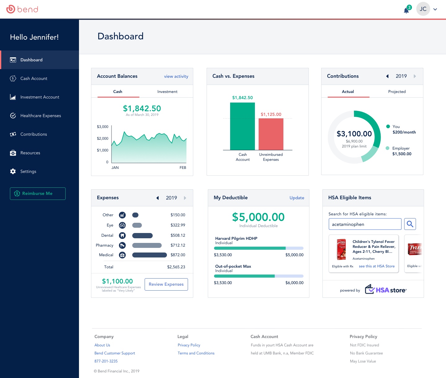
Reimagining the Bend HSA Expense Tracker
How can we improve the health expense tracker’s ease of use and functionality, so users can utilize their HSA to its full potential?
Reimagining the Bend HSA Expense Tracker
Client
Bend Financial
FinTech · Health Savings
Role
UX Designer
Category
- UX Research
- Interaction Design
Timeline
3-week sprint
Problem
Making HSA Management Easier to Understand
Bend Financial helps members save, invest, and manage healthcare spending through their Health Savings Account (HSA). But the existing experience created friction across onboarding and expense tracking, making it difficult for members to understand their benefits and confidently manage their HSA.
Over a three-week sprint, I worked with two other designers to identify key pain points and redesign the experience using familiar interaction patterns and a clearer information hierarchy. Our goal was to make healthcare expenses easier to understand and manage while helping members get more value from their HSA.
Research
Our Process
- 1
Research
6 user interviews and a first round of usability testing on the live portal.
User interviewsUsability testingCompetitive analysis - 2
Define
Synthesized findings into personas and a shared set of design focuses.
Affinity mappingPersonasHeuristic evaluation - 3
Ideate
Timed design studio sketching, then merged into one direction as a team.
Design studioSketchingWireframing - 4
Prototype
Built out the redesign using Bend's Atomic Design component library.
Atomic design systemInvision prototype - 5
Test
A second usability round validated the terminology and flow changes.
Usability testing round 2Iteration
Research
Fieldwork at a glance
Passed for Participation
Initial Usability Test
Redesigned Usability Test
User Interviews
The numbers pointed to one root problem: People didn’t trust a portal they didn’t fully understand.
Understanding
The User
User Interviews
Our initial steps were to gather an understanding of users who have a health savings account, and how they interact with it. Through user interviews, we asked our users several questions to gain insight.
01
What are users' current understanding of their HSA?
02
What are users' current expense tracking habits?
03
What, if any, applications users used for tracking finances?
04
What are users' expectations of an HSA administrator such as Bend?
Understanding
The Product
Goals and Features
To better understand the product's objectives and technical constraints, I conducted stakeholder interviews and reviewed existing documentation.
01
The portal needed to support responsive design for various devices (desktop, tablet, mobile).
02
Integration with existing backend systems for real-time data synchronization was crucial.
03
Enhance security measures and compliance with healthcare regulations.
04
Implement new features such as personalized financial insights and educational content.
Affinity Mapping
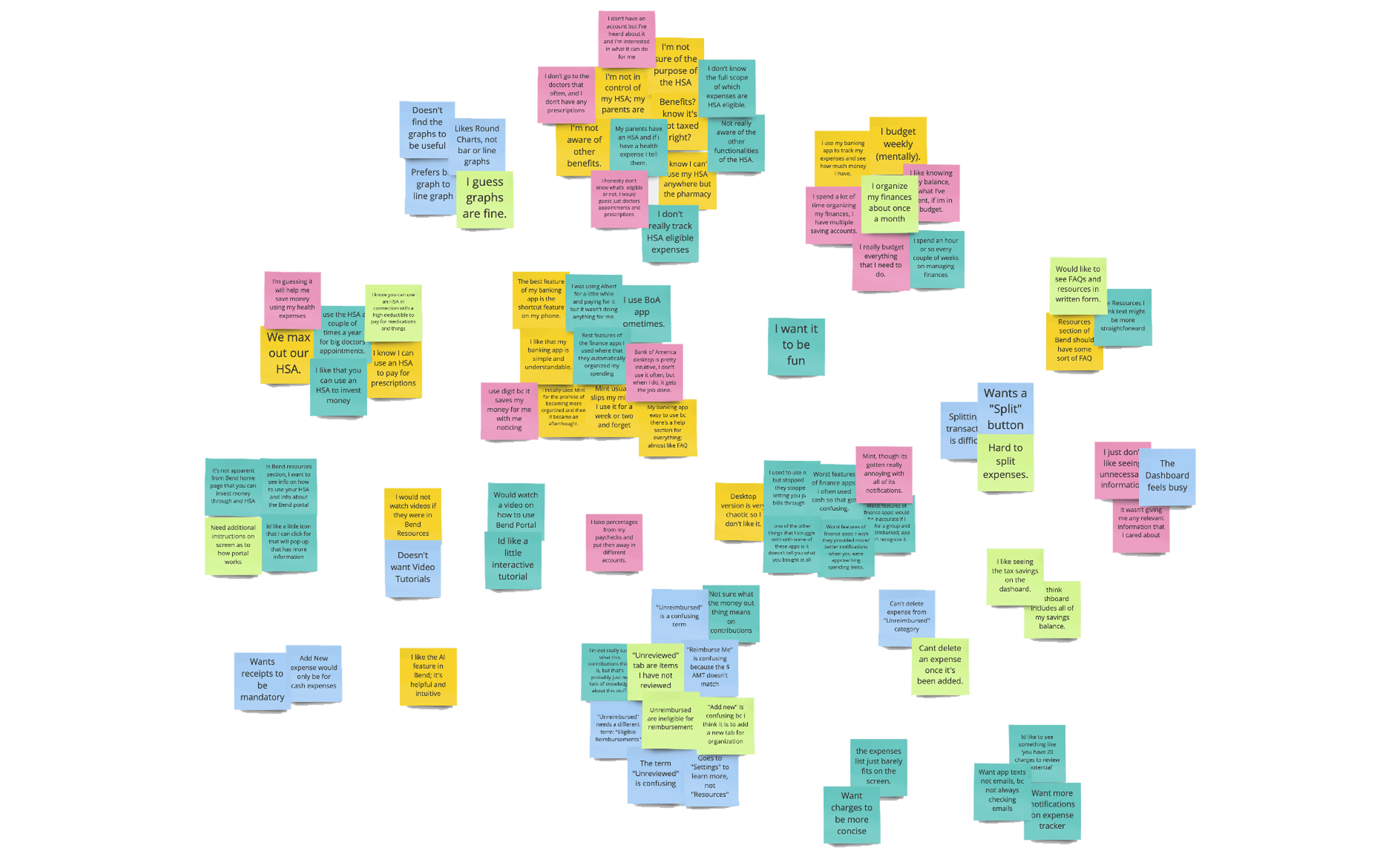
Key User Insights
01
Understanding
- Not fully aware of all the benefits their HSA offers.
- Confused by site terminology, including "Unreviewed" and "Unreimbursed."
02
Behavior
- Budget expenses on a regular cadence — weekly or monthly.
- Struggle to split and delete expenses in the current flow.
03
Expectations
- Want more guidance on how to actually use the product.
- Want a clean portal, not one crowded with distracting elements.
Personas

Frequent User
Organized and already maximizing their HSA
Behavior
- Makes regular contributions to HSA out of payroll
- Uses HSA to invest money and regularly checks investments
- Has infrequent doctors' appointments
- Is organized and regularly tracks finances
- Enrolled in a high deductible insurance plan
Goals
- Wants to maximize saving opportunity
- Is utilizing HSA to full potential by keeping track of health expenses

Infrequent User
Rarely checks in and needs help getting started
Behavior
- Has infrequent doctors' appointments
- Enrolled in a high deductible insurance plan
- Does not regularly track finances
- Makes HSA contributions only occasionally prior to expected health expenses
- Does not check HSA regularly
Goals
- Needs assistance in managing health expenses
- Has minimal understanding and open to learning more about the benefits of an HSA
Challenges and Solutions
Competitive Analysis
We faced a challenge in conducting competitive analysis on competing health savings account applications because we were unable to create accounts and log into without a high deductible health insurance plan.
As a solution we studied design patterns for simple task in applications like Google Mail. We worked around the lack of access to finance applications by watching YouTube demos where we pulled best practices relating to health expense tracking and onboarding.
Findings
01
Users want a clean, learnable portal — not more functionality
02
Categorizing and updating expenses needs to be effortless
SWOT Analysis
Strengths
- Digital Interface
- Artificial Intelligence Function
Weakness
- Users not taking advantage of the products full functionalities
- Lack of flexibility within expense tracking
Opportunity
- Product redesigns
- Educating the user for both user needs and business goals
Threats
- Emerging competition
- Shifting political and legal landscape
Strengths
- Digital Interface
- Artificial Intelligence Function
Weakness
- Users not taking advantage of the products full functionalities
- Lack of flexibility within expense tracking
Opportunity
- Product redesigns
- Educating the user for both user needs and business goals
Threats
- Emerging competition
- Shifting political and legal landscape
Users didn’t need more features. They needed the ones already there explained in language they trusted.
Collaboration
Current Interface
Define and Ideate
In addition to the issues found while conducting usability tests on the current interface, we familiarized ourselves with the product and conducted our own assessment of the portal as well. Associating our findings from our initial research and our heuristic evaluation, we compounded key focuses for the redesign.
Element Focuses
Onboarding
Add onboarding features to clarify functionalities of the Portal.
Taxonomy
Redefine the taxonomy of the health expense tracker and revise information architecture.
Edit Flow
Update the edit functionalities in the health expense tracker.
Feedback
Include clear feedback and error prevention messages.
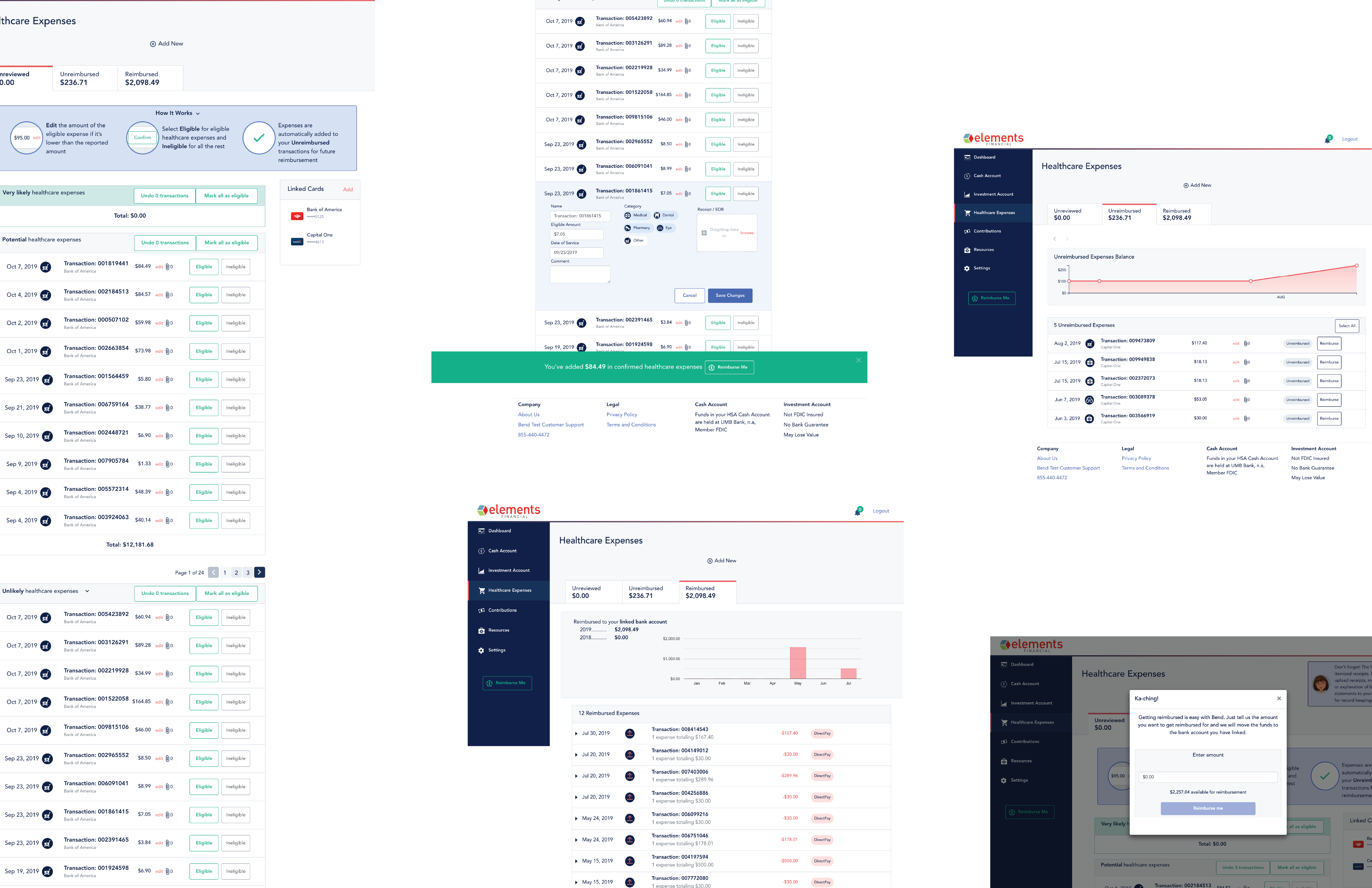
Design
Ideation
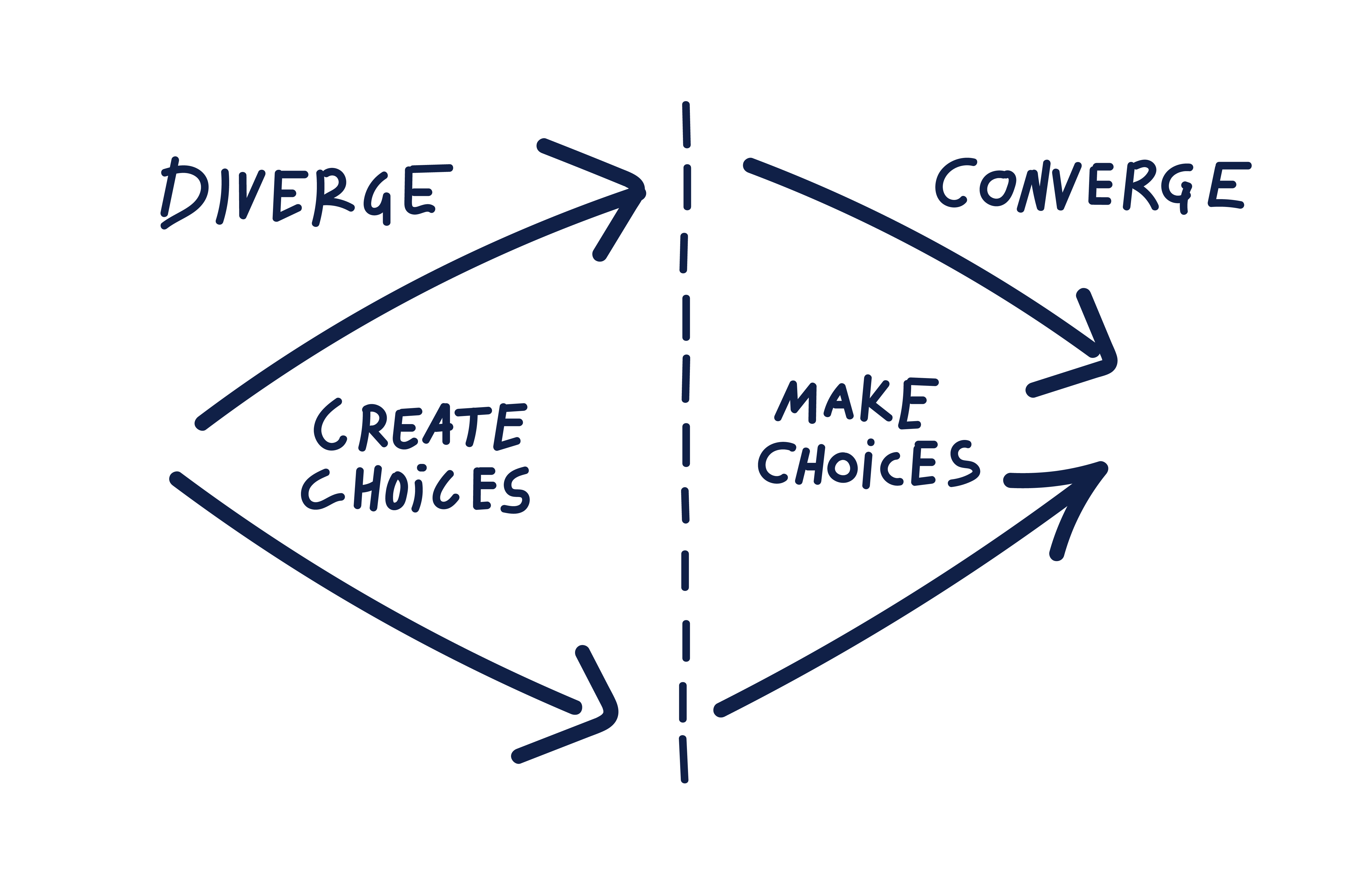
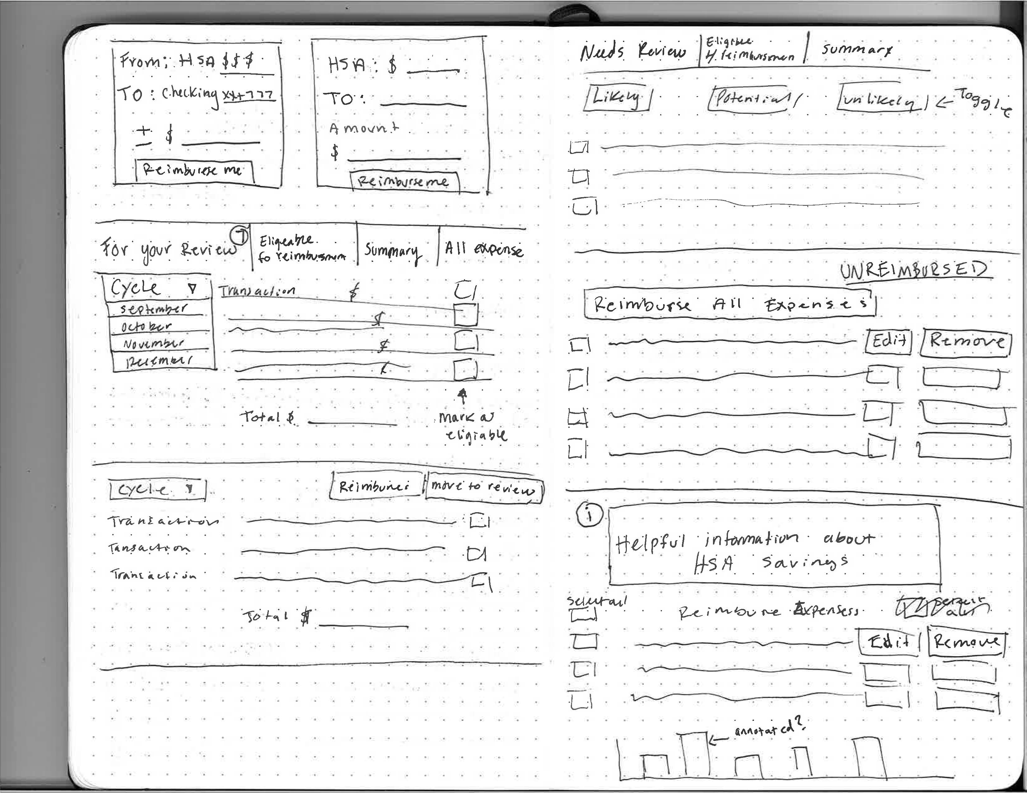
Sketching
We conducted a design studio where we picked a section to redesign and set up a clock to 10-15 minutes in order to create design choices and then make decisions on the different options.
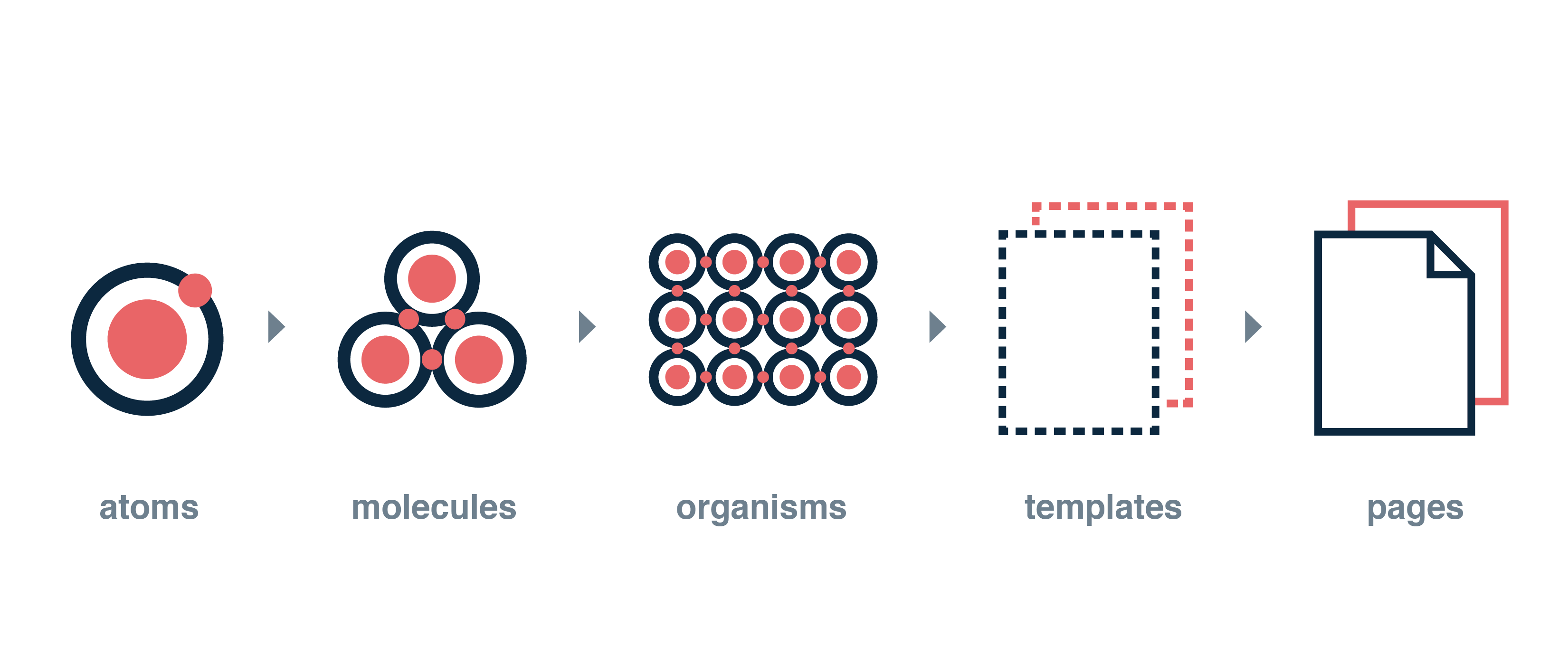
Atomic Design
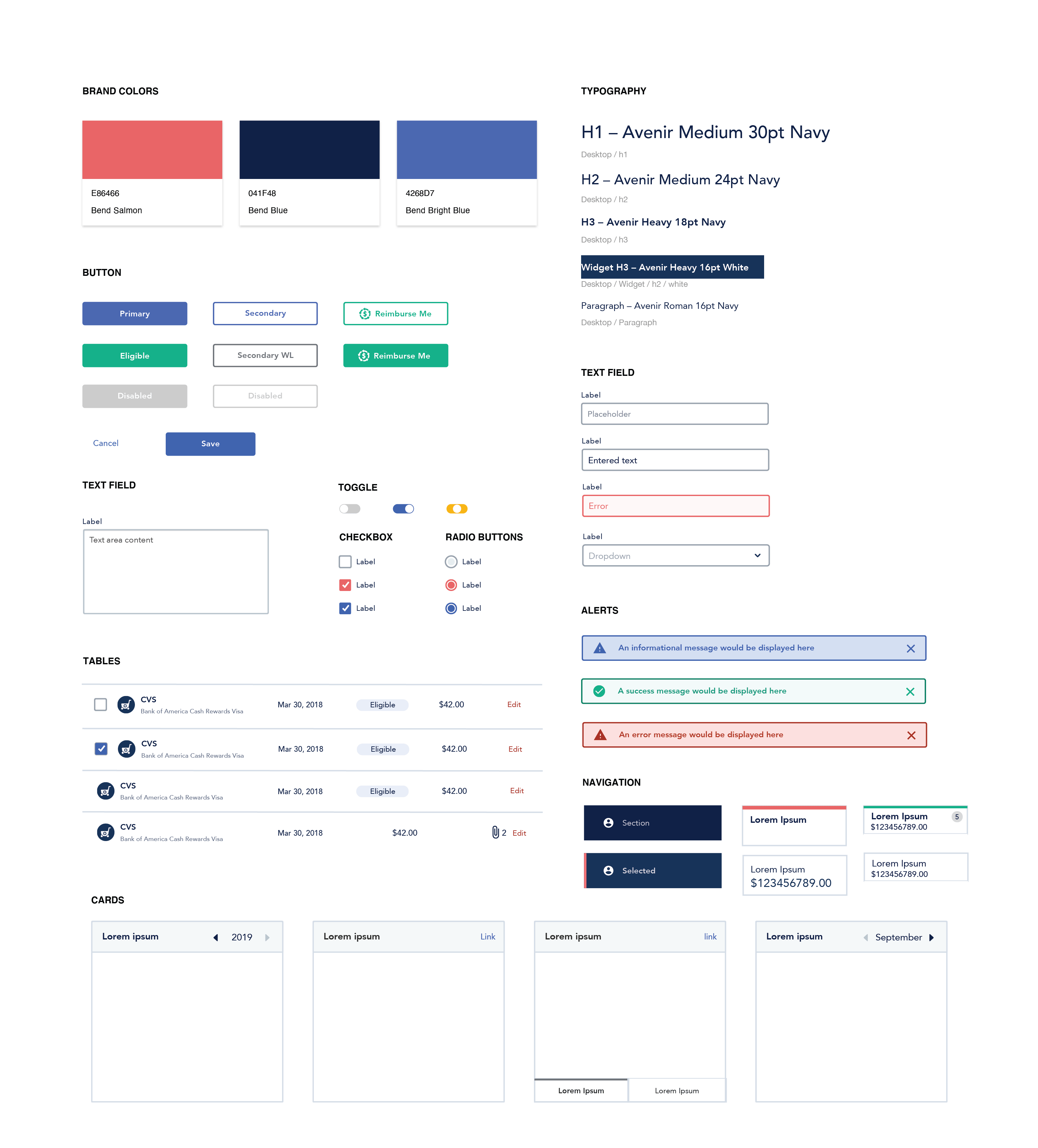
We were given access to Bend's design library, which was constructed based on the principles of Atomic Design. This system allowed me to redesign Bend's interface with building blocks, i.e. atoms, molecules and organisms.
Design System
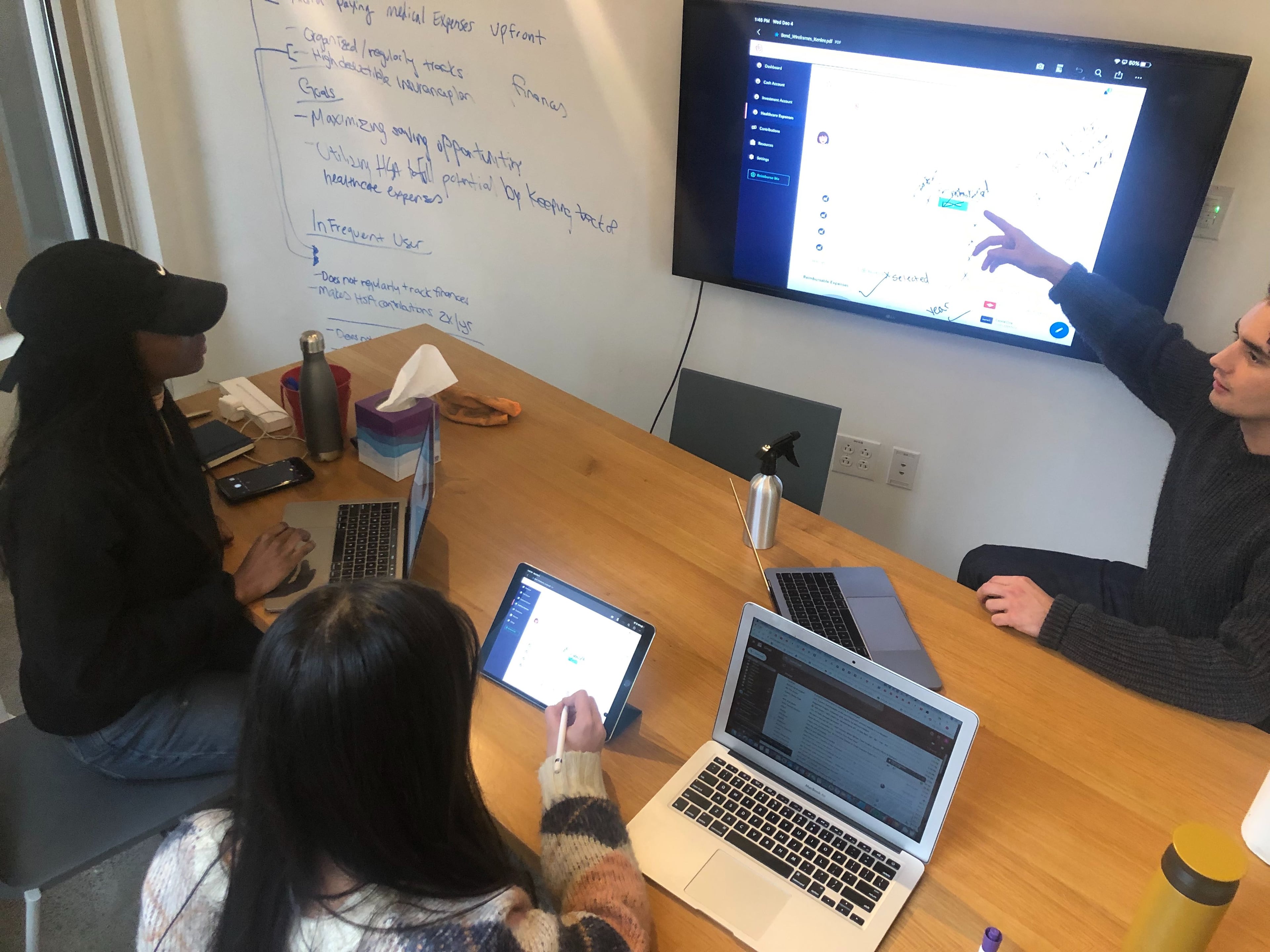
Marking Up Wireframes
Iterations
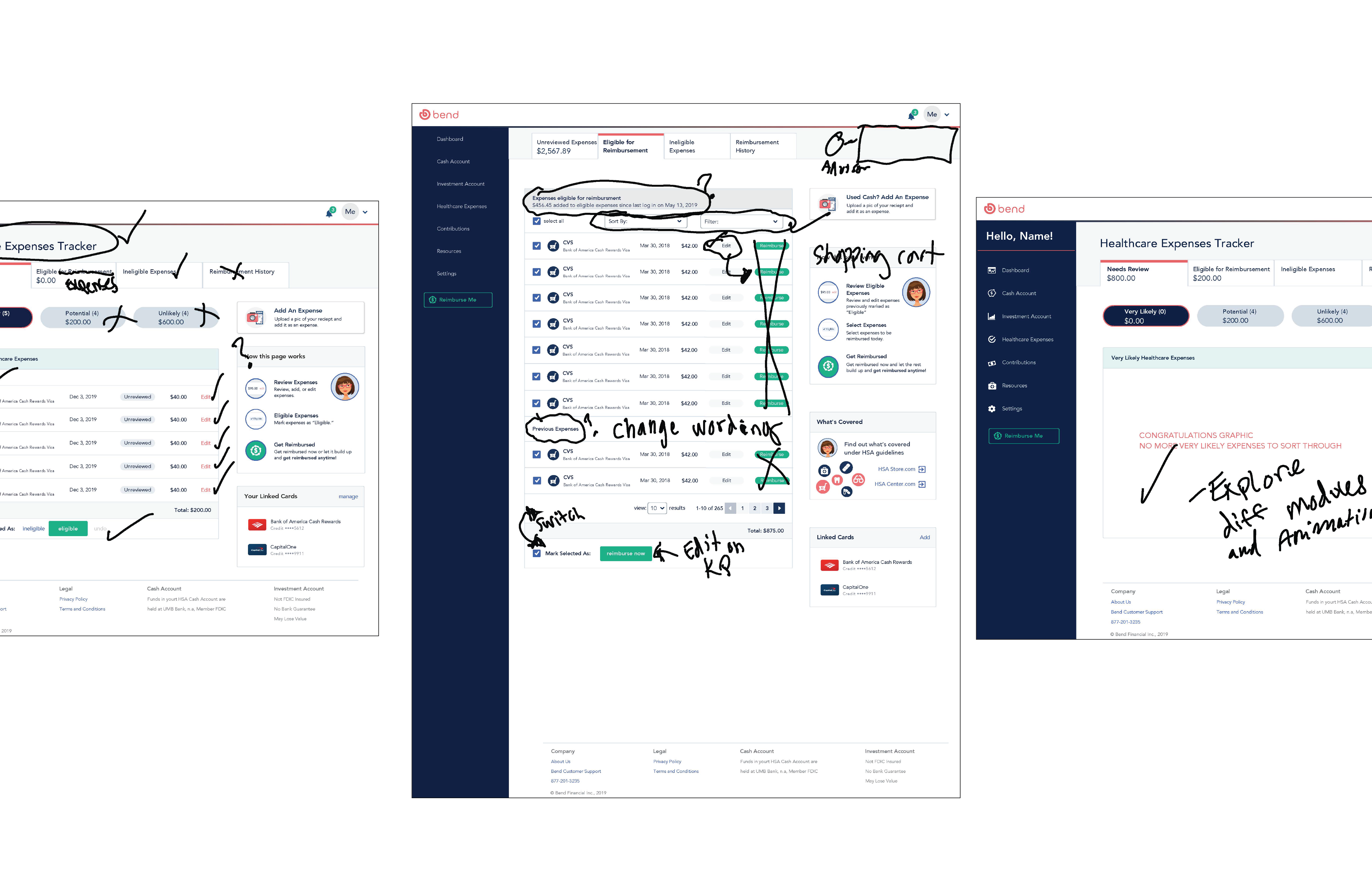
After working individually on our wireframes, we all sat together, compiled our designs, and marked up the ideas we liked and wanted to incorporate in the master. We also determined ideas to just throw out and things to explore more with sketches/wireframes.
Key Insights
What the markup session decided
Four calls from the collaborative review shaped what moved into the master wireframes—and what we cut before testing.
Markup decisions
Keep · Rename · Add · Cut
- 01
Taxonomy
Remove pill tabs and rename sections to match how members think about expenses.
- 02
Repetition
Keep only repeating patterns that earn their place—cut anything that adds noise.
- 03
Success screen
Add a clear completion moment after expense review so members know they're done.
- 04
Shopping cart
Drop the cart-style pattern to keep the expense flow short.
Applied to
Master wireframesUsability round 2
Results
Usability Test, Round 2
Testing and Iterations
After redesigning key expense tracking and onboarding moments, we ran a second usability round to pressure-test what still caused hesitation.
Iteration focuses
Clarify · Confirm · Clean up
- 01
Terminology
Clarify the confusing terms that showed up in round-one testing.
- 02
Ineligible flow
Make "Mark as Ineligible" explicit with clear feedback before the change sticks.
- 03
Visual cleanup
Tighten spacing, buttons, and pop-up messaging so the flow feels consistent.
Applied to
Expense reviewOnboarding
Before
After
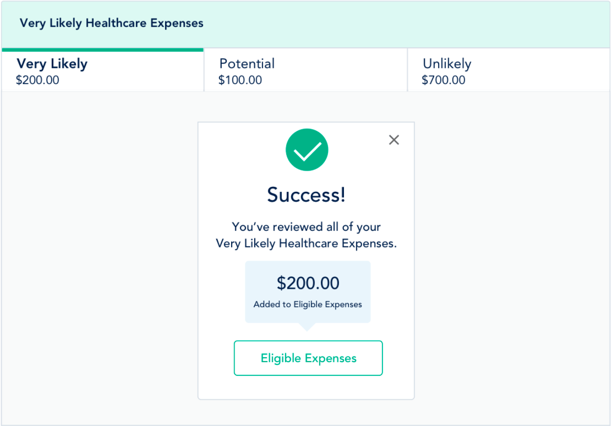
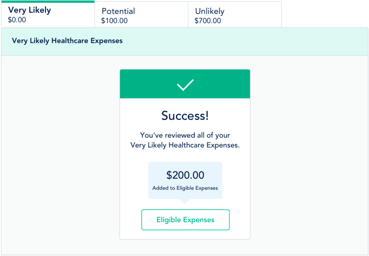
We decided to switch the placement of the tabs because the proximity of the higher navigation tabs caused confusion. For the success screen, we added a way to exit the screen because users were pigeon holed into only continuing onto the 'Eligible Expenses' section.
Before
After
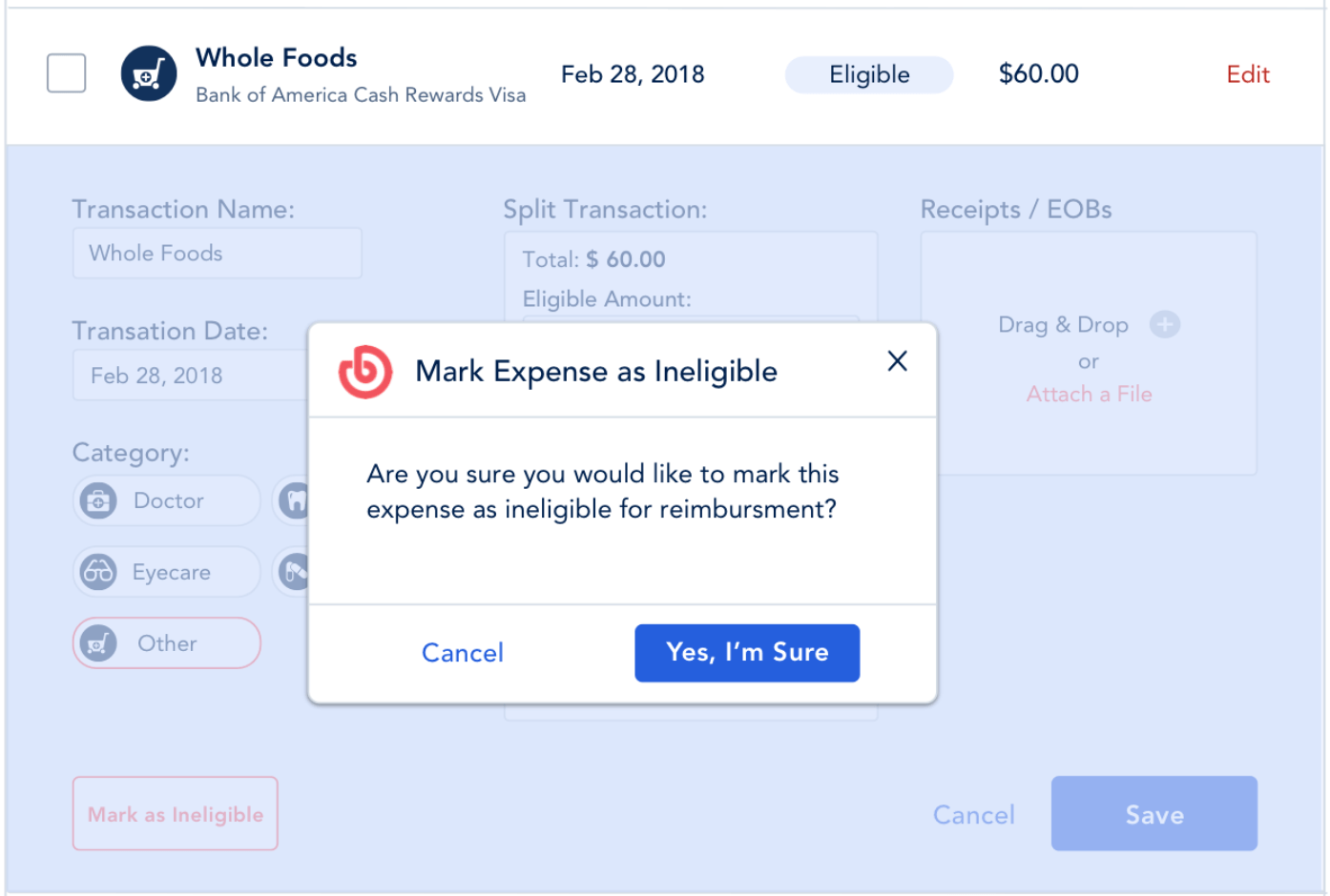
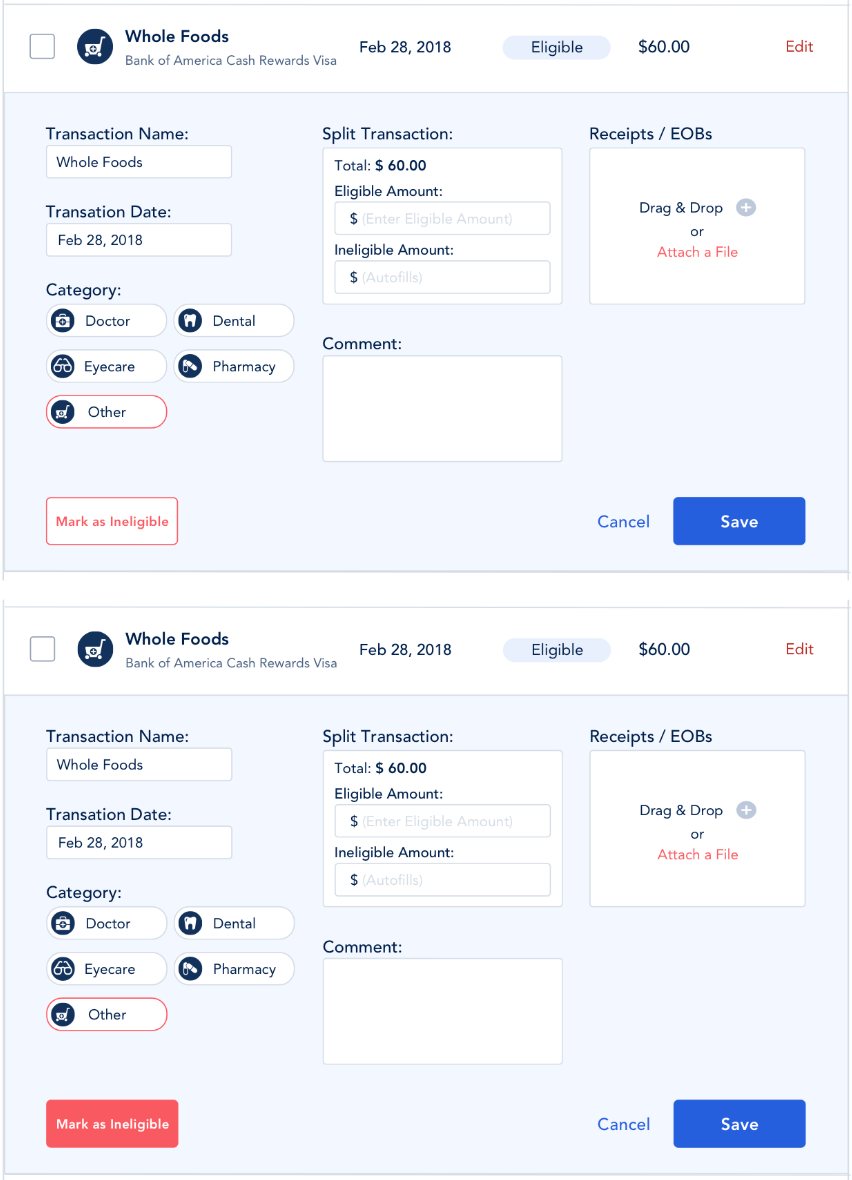
When marking an expense as ineligible in the edit function, originally the color of the button would inverse to indicate the button was 'on'. This caused confusion because the action wasn't clear. We added a confirmation dialog to make the action explicit and prevent accidental changes.
The second round of testing didn’t add features — it replaced ambiguity with one clear action for every expense.
Ideal State Flows
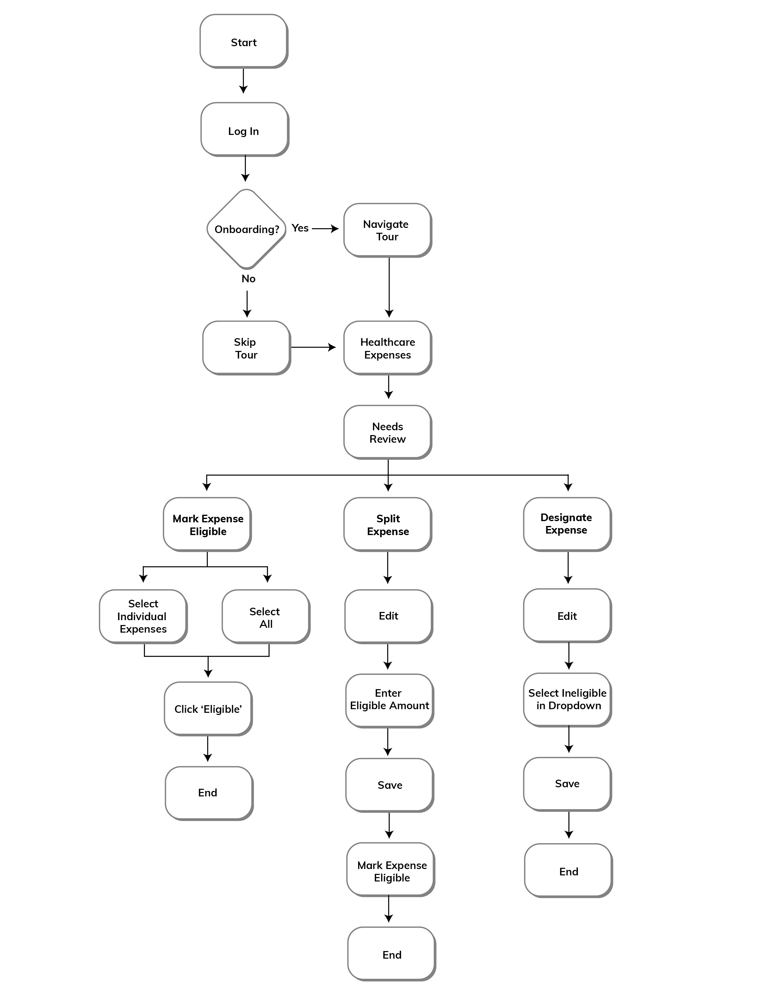
Pinch or ⌘/Ctrl + scroll to zoom, drag to pan. Use the controls to reset or open full screen.
Interactions
Solution Prototype
The key to good micro-interactions is to make them feel natural and intuitive. This means designing them so that they are not disruptive to the user's workflow but instead provide subtle feedback and guidance.
Onboarding
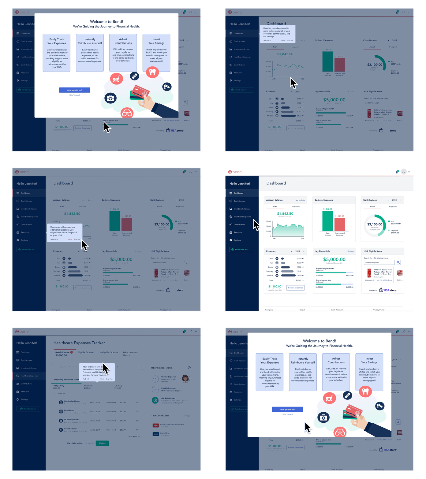
Bend's artificial intelligence the 'Bend Advisor' will help give users a clear understanding of the portal. When users arrive onto a page for the first time, users will be prompted on the key functions for that particular page.
Needs Review-Very Likely Expenses
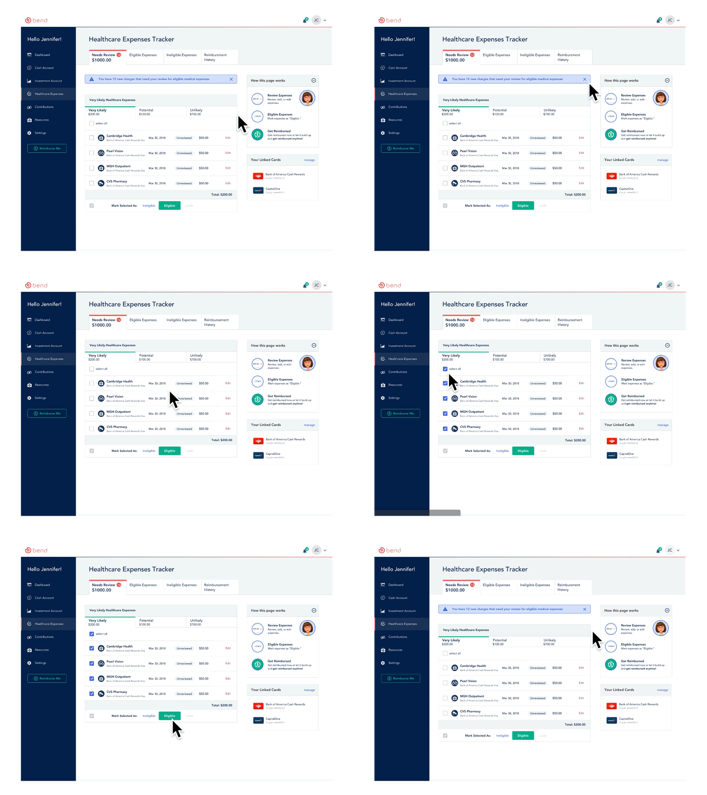
The Bend Advisor reviews the user's transactions and categorizes them into 'Very Likely', 'Potential' and 'Unlikely' health expenses. On each login, the user is notified of how many health expenses to review and has to mark each as 'Eligible' or 'Ineligible' for reimbursement.
Splitting a Transaction that includes a Health Expense
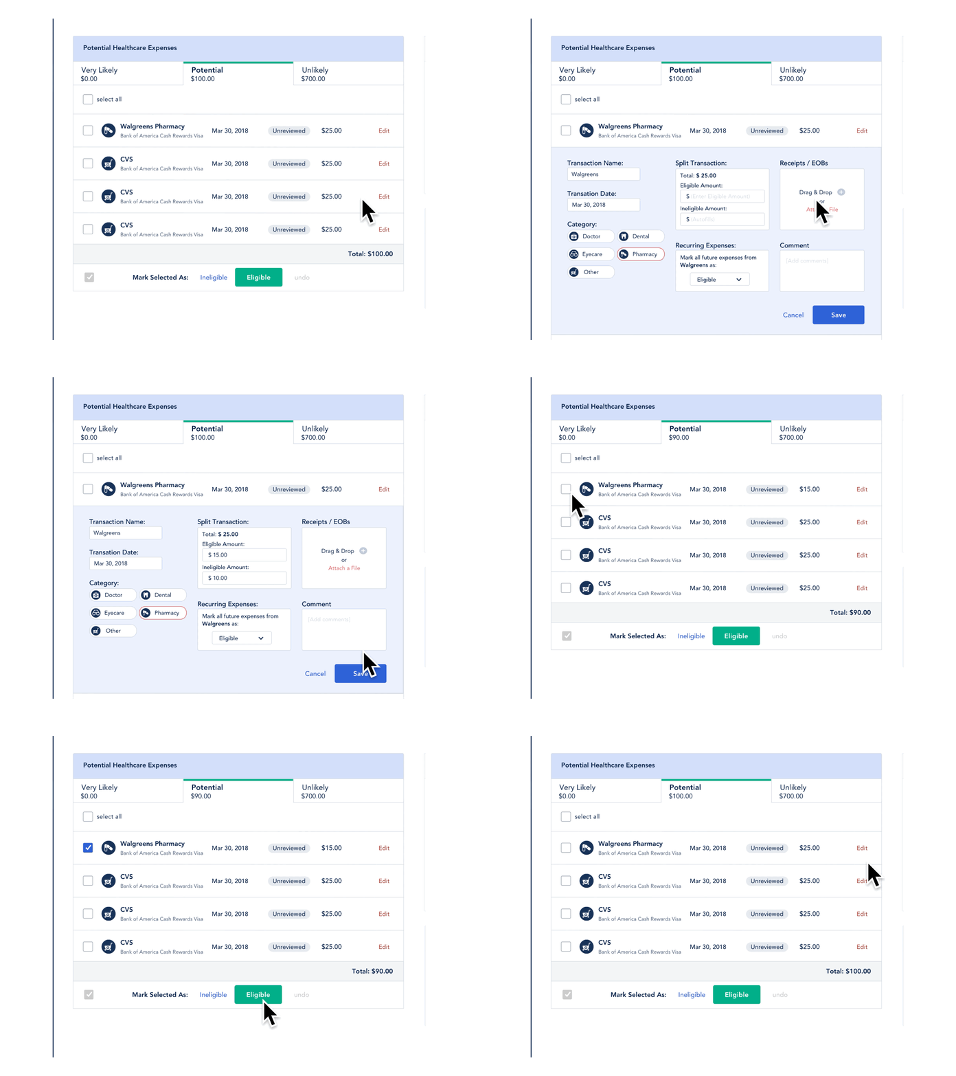
Expenses that have the potential to be a healthcare expense, are populated in the 'Potential' section. The user is able to edit the expense, split the eligible amount, add a receipt, and mark it eligible for reimbursement.
Designating a Non-healthcare Transaction as Always Ineligible
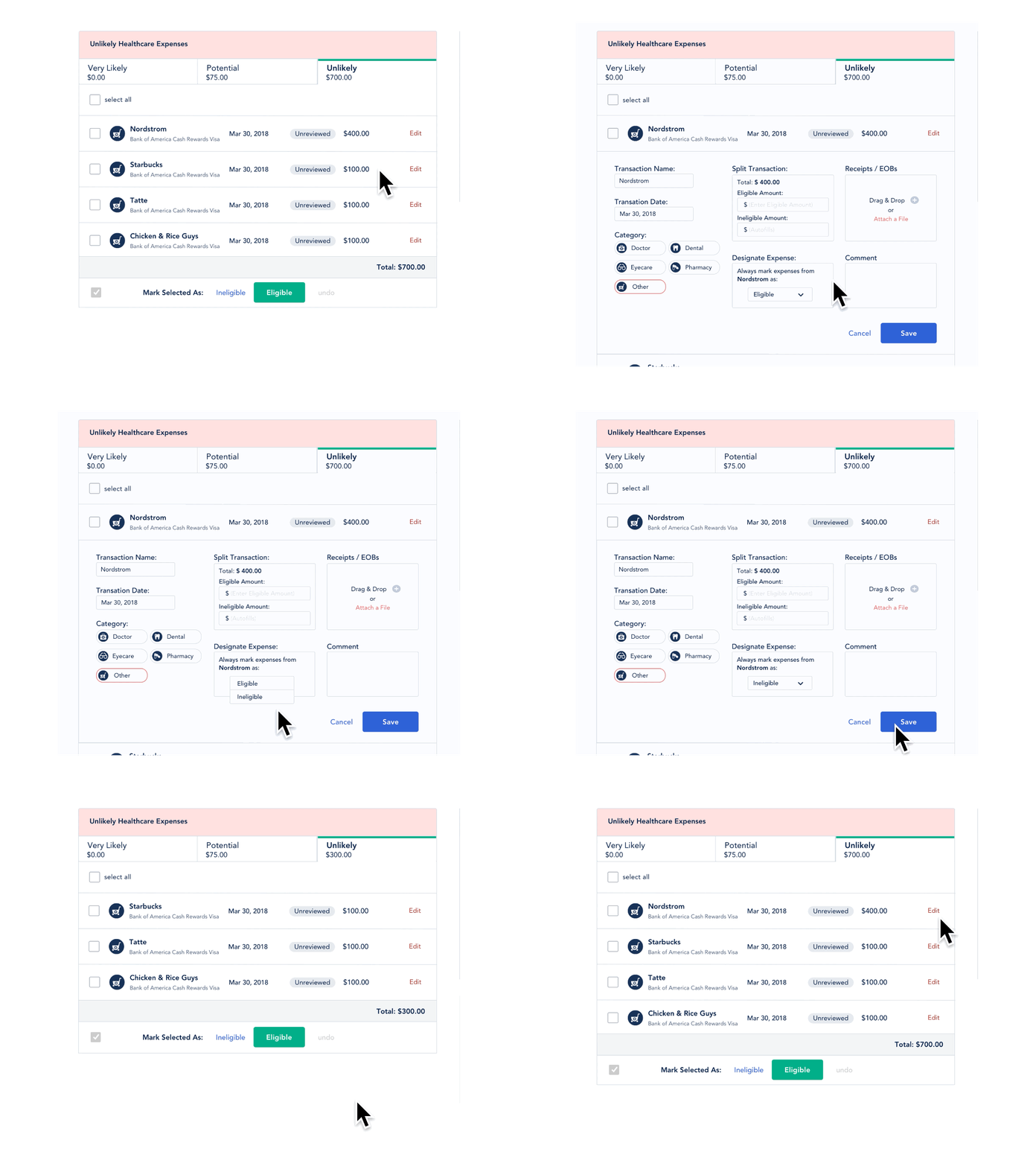
For transactions that will never qualify for HSA reimbursement, users can mark them as always ineligible. This prevents repeat review of the same non-healthcare purchases and keeps the expense tracker focused on items that actually need attention.
Removing an Expense Marked as Eligible for Reimbursement
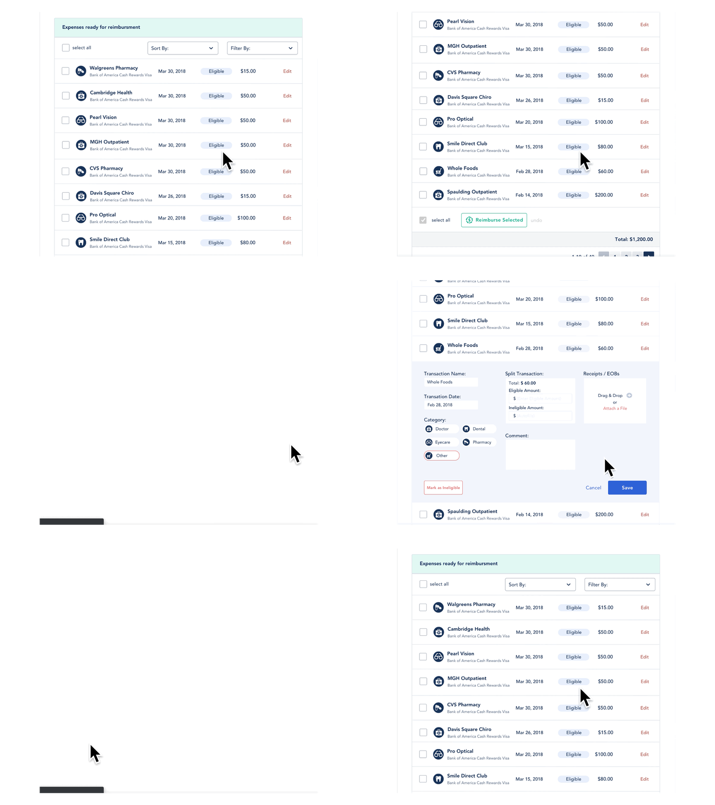
Mistakes will happen and users need a way to undo any actions that they have taken. In this case, an expense was marked as eligible but it is in-fact ineligible and needs to be removed. The user can edit the transaction and in 2 steps remove the transaction from the 'Expenses ready for reimbursement' list.
Selecting Expenses for Reimbursement
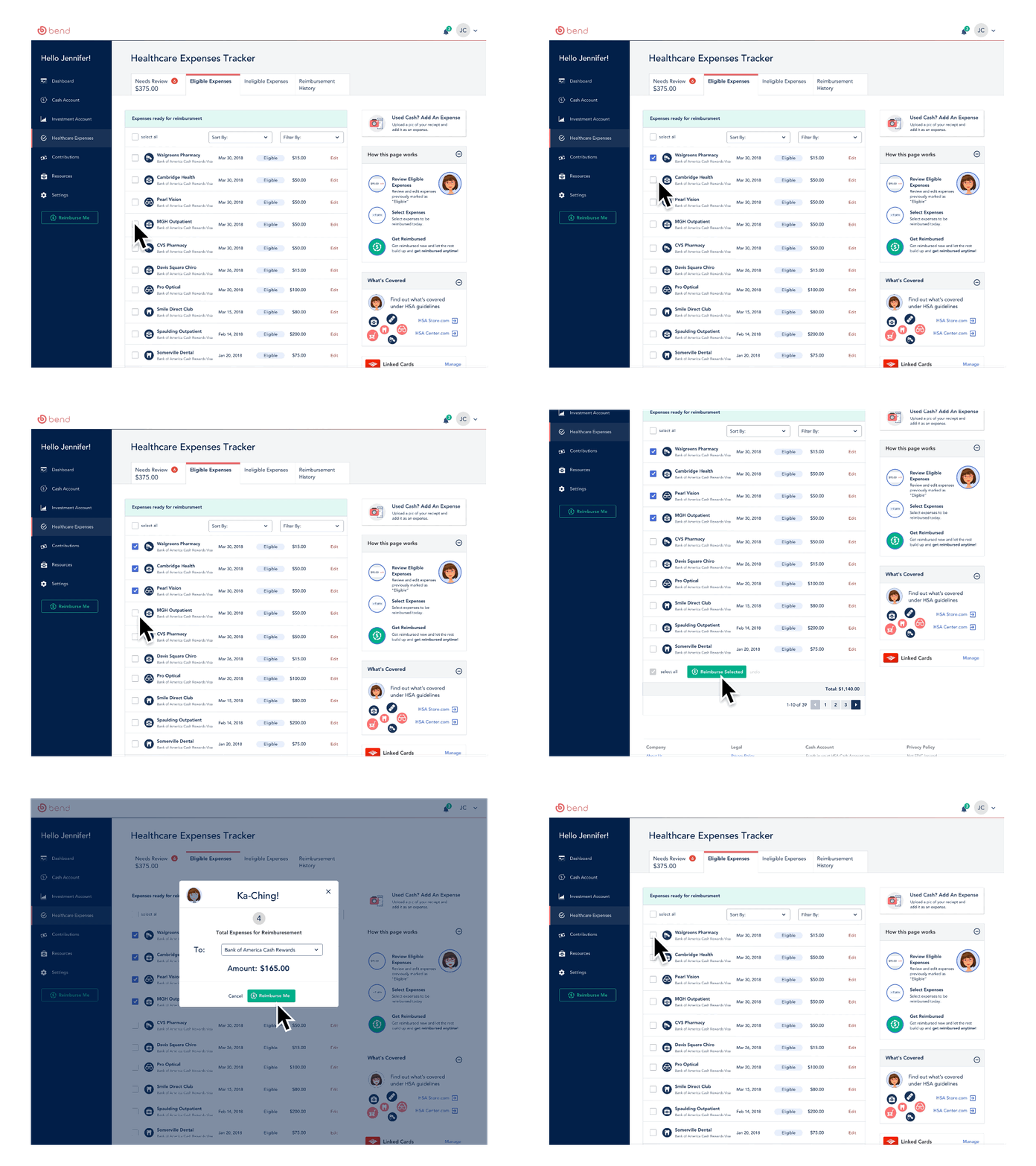
When the user is ready to be reimbursed, they are able to select specific transactions and designate which account the money will go to using the drop-down menu. Once the action is complete, the user receives a confirmation screen.
Designing within an existing product
This project reinforced that improving an existing product means working within the systems and constraints already in place. Designing within Bend's Atomic Design System required us to balance new ideas with established patterns, while close collaboration with developers helped ensure the experience could translate cleanly from design to implementation.
The limited project timeline also meant making intentional decisions about where to focus our research and what to validate next. With more time, I would continue testing the experience with Bend members and use those findings to refine onboarding, education, and key account workflows.
Next Steps
01
Validate with Members
ResearchTest the redesigned experience with Bend members to validate the navigation, terminology, and expense-tracking workflows.
02
Strengthen Onboarding & Education
Experience StrategyExplore how onboarding and contextual guidance could help first-time members better understand and use their HSA.
03
Refine Key Account Workflows
Interaction DesignContinue improving the dashboard and expense-management experience based on member feedback.
Next project: Designing Impact Capstone