Identify & Research
Surface the pattern from real product work, then research use cases, capabilities, and best practices.

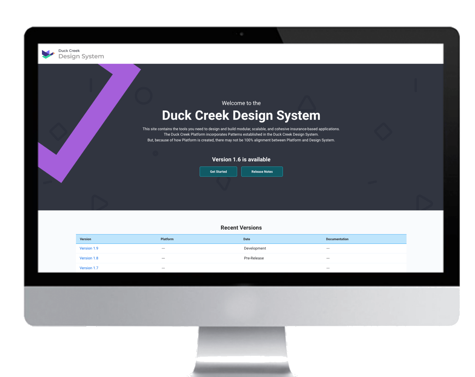
Establishing shared components, patterns, and specifications across an enterprise insurance platform.
Client
Duck Creek Technologies
Enterprise SaaS · Insurance
Role
Product / UX Designer
Category
Year
2022
Problem
Duck Creek products were migrating onto a shared enhanced platform, the technical foundation for every application, including its low-code configuration tools. The same components and patterns were being rebuilt slightly differently by different teams, with no shared source of truth.
Overview
Duck Creek Technologies builds enterprise insurance software used by carriers worldwide. As more products adopted the shared platform, I helped the Design System absorb new components quickly: defining styles, states, and behavior, then documenting standards so any team could adopt them consistently.
Overview
As the need for new components comes up from design work, the Design System needs to provide the styles and capabilities to be adopted, as well as defining standards, best practices, and guidance.
In addition, establishing a library of patterns that will encourage consistency and help designers and developers understand how Duck Creek elements can address specific user needs within an application when put together.
Goals & Approach
The design system defined the reusable building blocks for the platform, while the pattern library documented how those components should work together to solve common user workflows. Together, they created a shared language that improved consistency, reduced reinvention, and supported scalable product development.
Design System
Pattern Library
Process
Every new pattern followed the same three-step path before it was considered part of the system:
Surface the pattern from real product work, then research use cases, capabilities, and best practices.
Document usage, a breakdown of pattern elements, variations for different use cases, and best practices.
Every pattern passed through a Tech Writer and Visual Design review before publishing.
Identify and research
A global search pattern existed in some form across nearly every product, but no two implementations agreed. Labels, controls, and layouts diverged even though every team was solving the same underlying need, forcing users to relearn the pattern each time they moved between products.
Three products, three different “global search” implementations, consolidated into a single reusable pattern.
This research became the case for standardizing and documenting a single global search pattern with defined variants, rather than leaving each product to design its own.
Write the content
The resulting Global Search pattern documentation defines when to use it, its key elements, and the variations available, giving designers a single reference instead of reverse-engineering another team’s screen.
Published Global Search documentation: usage guidance, annotated anatomy, and key aspects of each control.
When a new product introduced a component the system did not yet have, such as bottom navigation, wireframes came first, followed by detailed specifications: colors, typography, spacing, and every interactive state, so engineering had exactly what it needed to build it correctly the first time.
Wireframes
Early wireframes established the structure and hierarchy of the new bottom navigation before full specification work began.
Wireframes introducing a new Bottom Navigation component.
Design specifications
Specifications for the styling and states of the component are defined and placed in a document. This gives the developer a better perspective of what the ask is for the component and how to build it.
Full state and style specifications: normal, hover, focus, pressed, selected, and disabled, handed off for development.
Not every need meant inventing something new. When new visual work called for a tile-style treatment of an existing radio button control, the job was to define every state precisely enough that it could be adopted consistently, and to document exactly when to reach for it instead of a default control or a selectable card.
New styles for existing elements
Radio buttons can be styled in different ways. With some new design work being done, a new style for radio buttons was introduced and needed definition and guidance.
Full state specification for the new Selectable Tile radio button style.
New element guidance
Selectable tiles and cards needed clear rules for when to use each option, how they behave in configurator contexts, and how they differ from default radio controls, so teams could adopt the right pattern with confidence.
Guidance covering selectable cards vs. tiles, configurator notes, and best practices for when to use each.
Outcome
The Design System now gives Duck Creek's product teams a shared, versioned source of truth: components with defined states and specifications, documented patterns like Global Search, and clear guidance on when to use each option. New components and styles are absorbed through the same research, document, and review process, so the system keeps pace with product work instead of falling behind it.
The hardest design system problems were not visual. They were about shared understanding: when to standardize, when to extend, and how to document decisions so the next team did not start from zero. The process (identify, write, review) mattered as much as any single pattern.
Real product work reveals the right patterns.
Auditing live experiences helped distinguish recurring needs from isolated requests and guided where standardization would create the most value.
The design continues beyond the interface.
Documenting behavior, states, and edge cases was essential to preserving design intent through implementation.
System growth should be intentional.
Not every new use case requires a new component. Often, the more scalable solution is to refine and extend what already exists.
Next project: Designing for Cross-Functional Alignment